Brief:
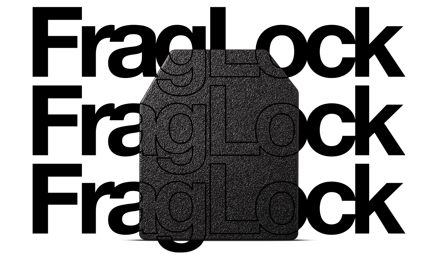
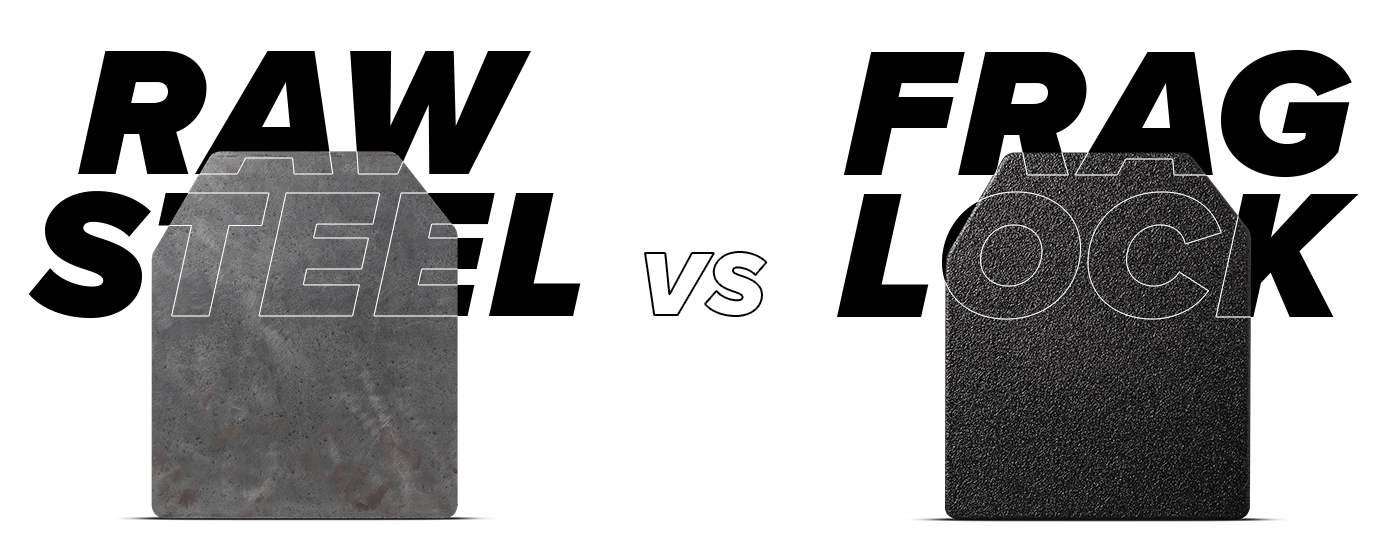
Create a variety of wordmarks for AR500 Armor's new proprietary spray coat technology that's used on their steel armor. This spray technology will help contain spall and fragmentation that is caused when a bullet hits a steel plate of armor.
Role:
Graphic Designer
Tools:

Goals:
The goal was to make this project as future proof as possible. While I'm currently updating the Armored Republic's and AR500 Armor's logos and symbols, I wanted to use this as an opportunity to showcase more examples of a clean and easy design. Ultimately, I should be able to place this logo or symbol next to other future brands and not see a shift in style or esthetics.
Challenges:
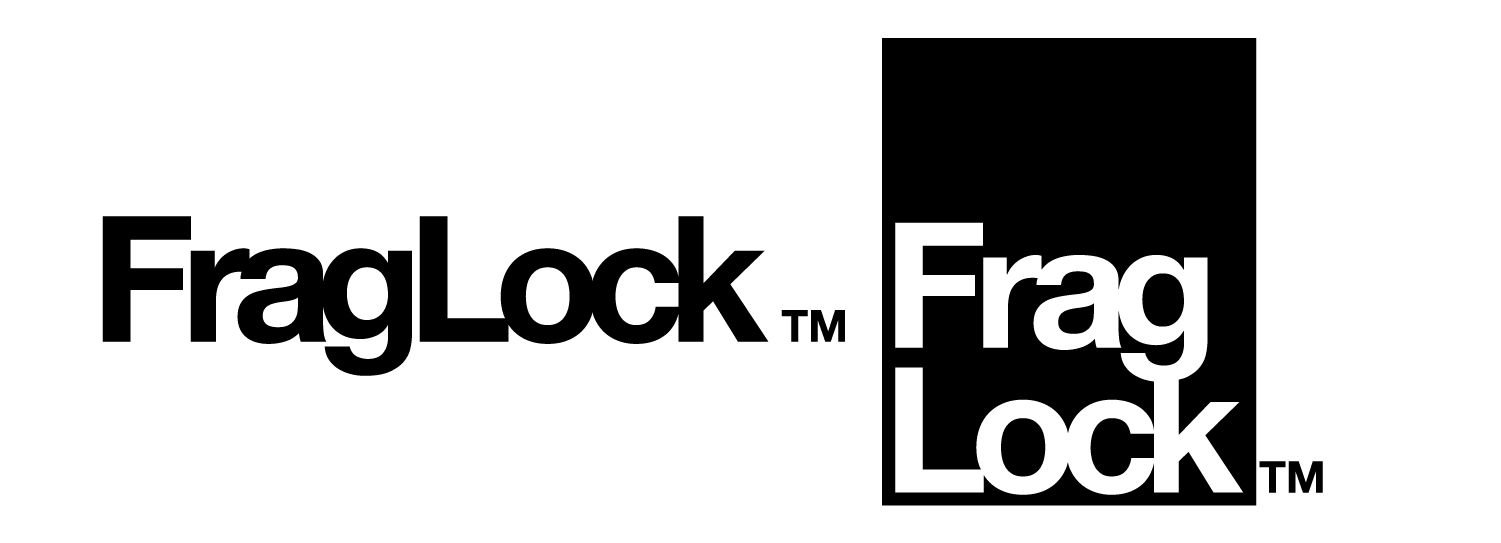
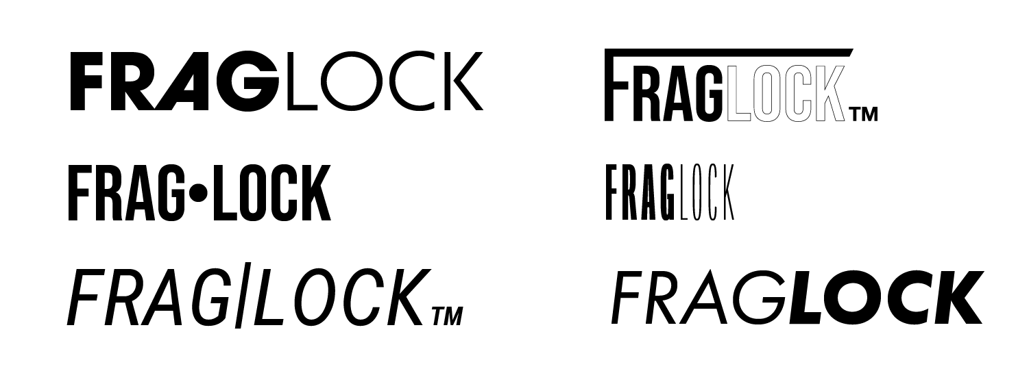
The few difficulties I had here were to stay away from the obvious "lock-like" symbols because I don't want people to think the logo had to do anything with security or actual locks. Another lettering issue I noticed was the the word "GLOCK" looking more prominent than ever, and I needed to either separate the words or create enough contrast to bring focus back to Frag and Lock.
As I looked at different typefaces, I wanted a strong and industrial looking sans serif with variable font weights to create the contrast I was looking for. I even tried pushing the two words together and separating them to see how the forms would respond.
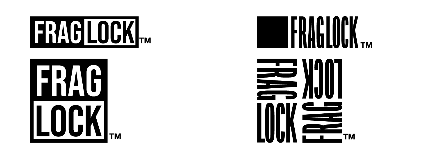
After doing some more experiments (on the left example), I really liked this box/container idea to emphasize the frag/spall would be contained and locked inside the coating. This also allowed me to look at just a simple square and have the words symbolize the box itself.
Solution:
In the end, I leaned away from sans serif types and to Helvetica Neue Bold. I adjusted the leading to make the letters just touch or lock in with each other. I felt that Helvetica was a better option as I believed it was be simple and easy to read at different sizes. In the second option for when a horizontal wordmark's won't fit in.