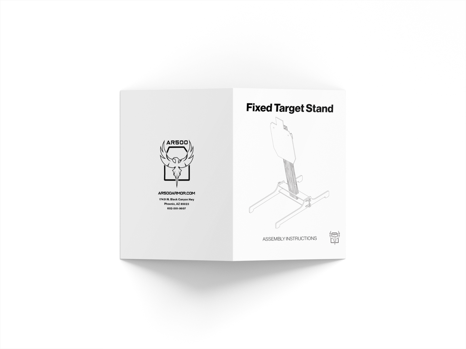
Brief:
AR500 Armor has a laundry list of improvement needs and something simple like a "How-to-put-together" Manual for their steel target stands was something they never had. I took it upon myself to create a system that I could replicate when it came to adding more target stands in the future.
Role:
Graphic Designer
Tools:

Goals:
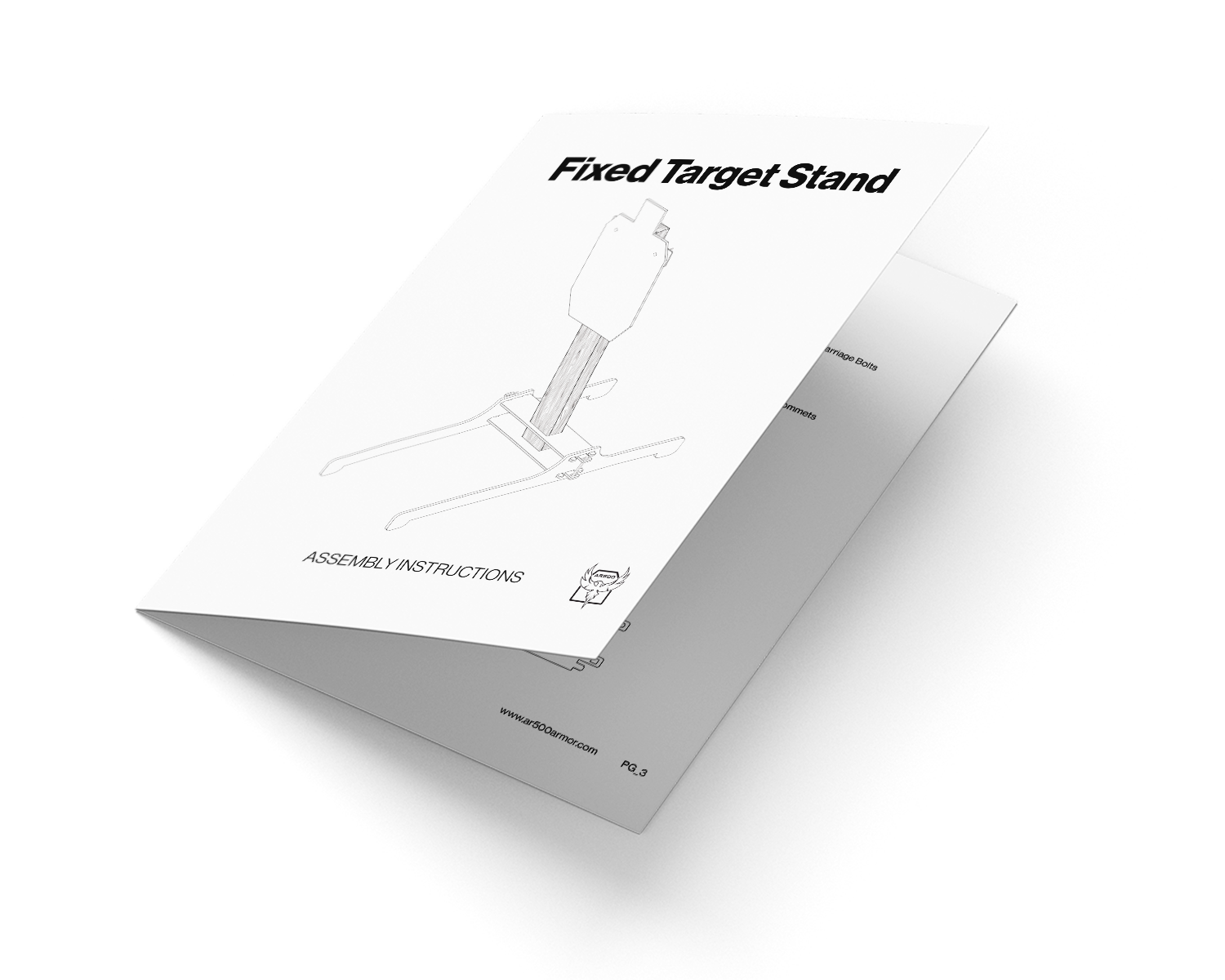
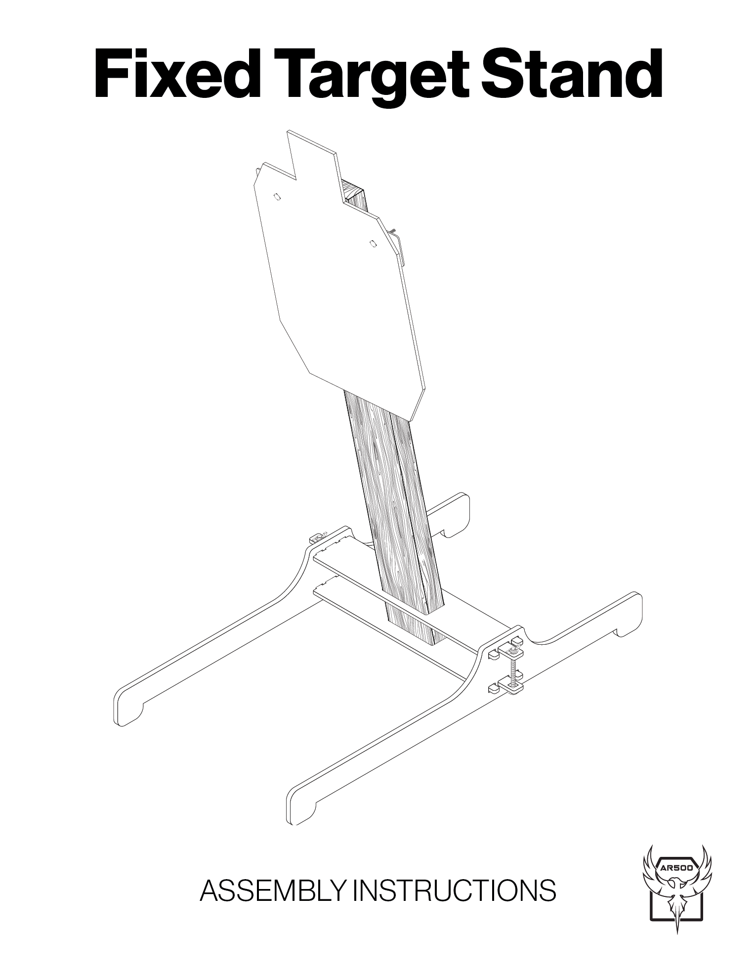
I'm always for simple, clear, and accurate instructions because we've all built something and have been frustrated by the horrible, poorly drawn manuals and said "forget it," and figured it out on our own.
So for inspiration, I turned to IKEA's manuals. Although in the past I hated them for the above mentions, they still fulfill the goals I have to create something simple. I just have to make sure it make sense.
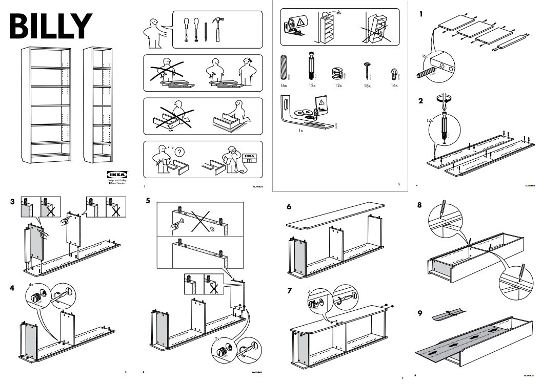
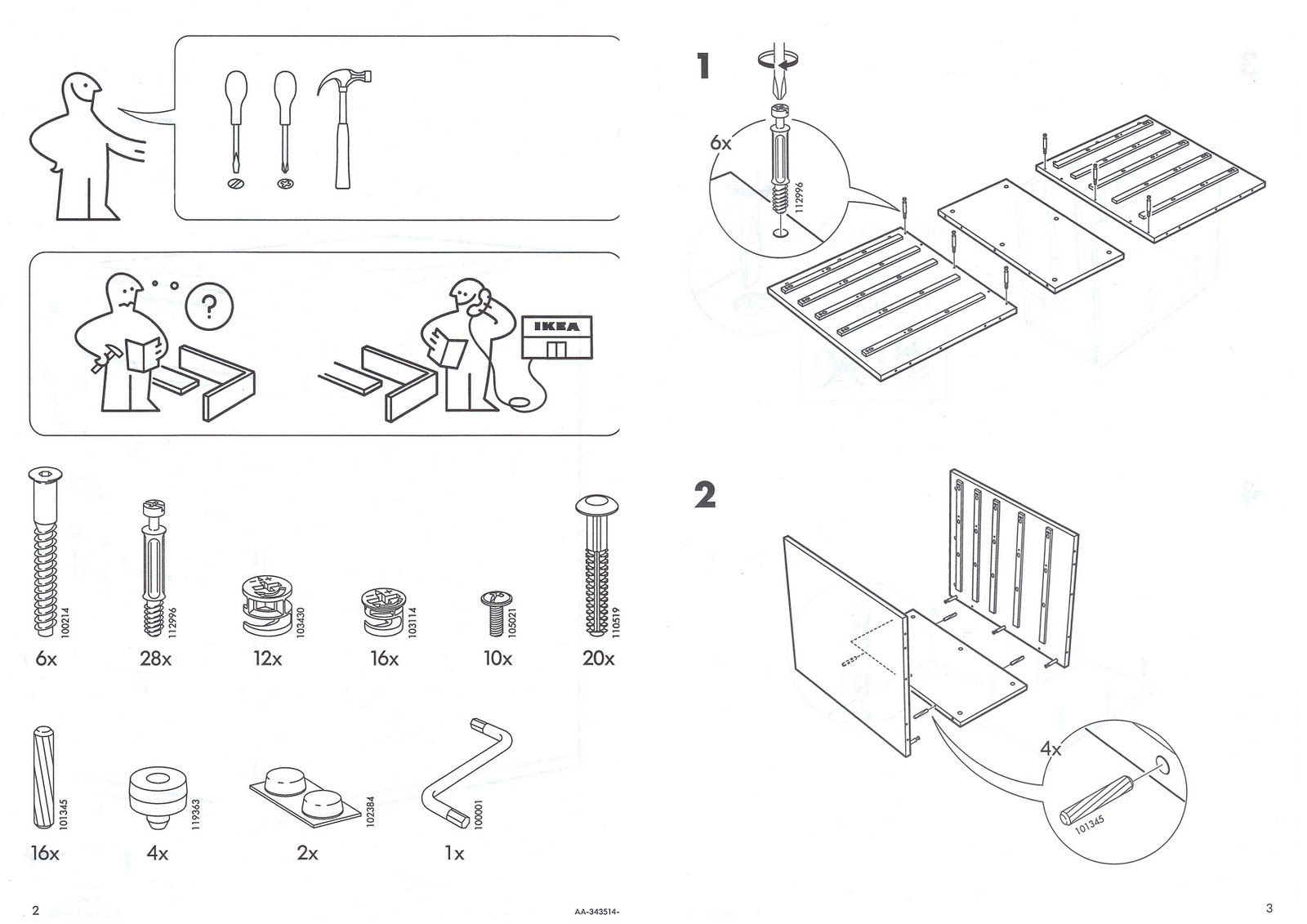
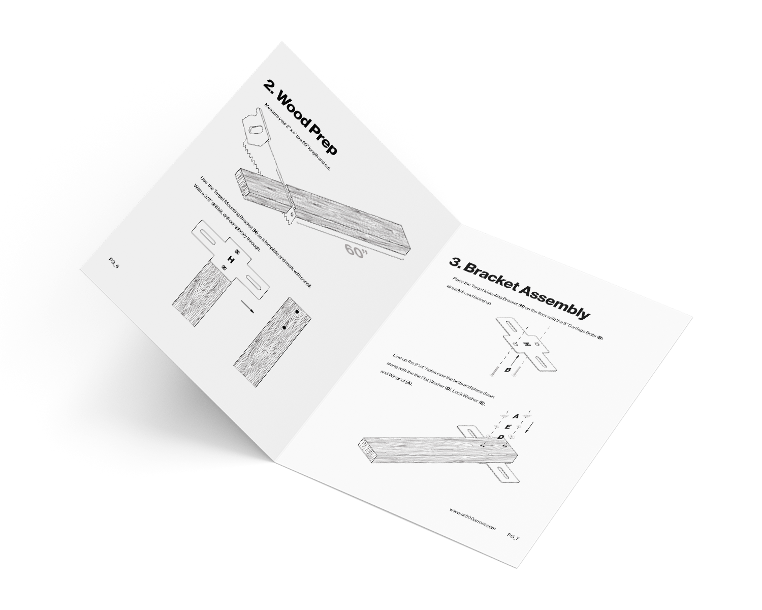
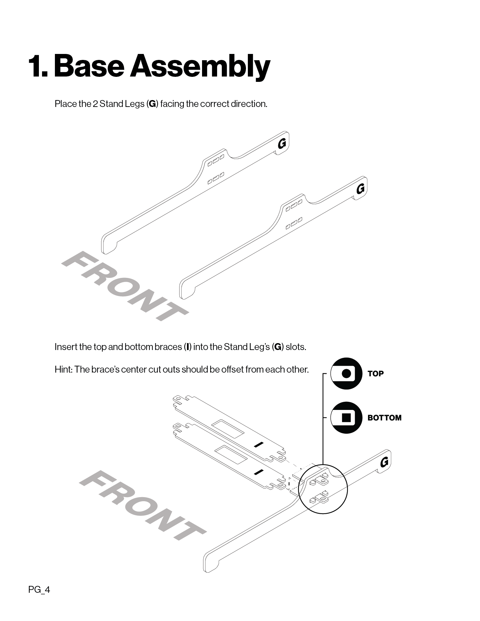
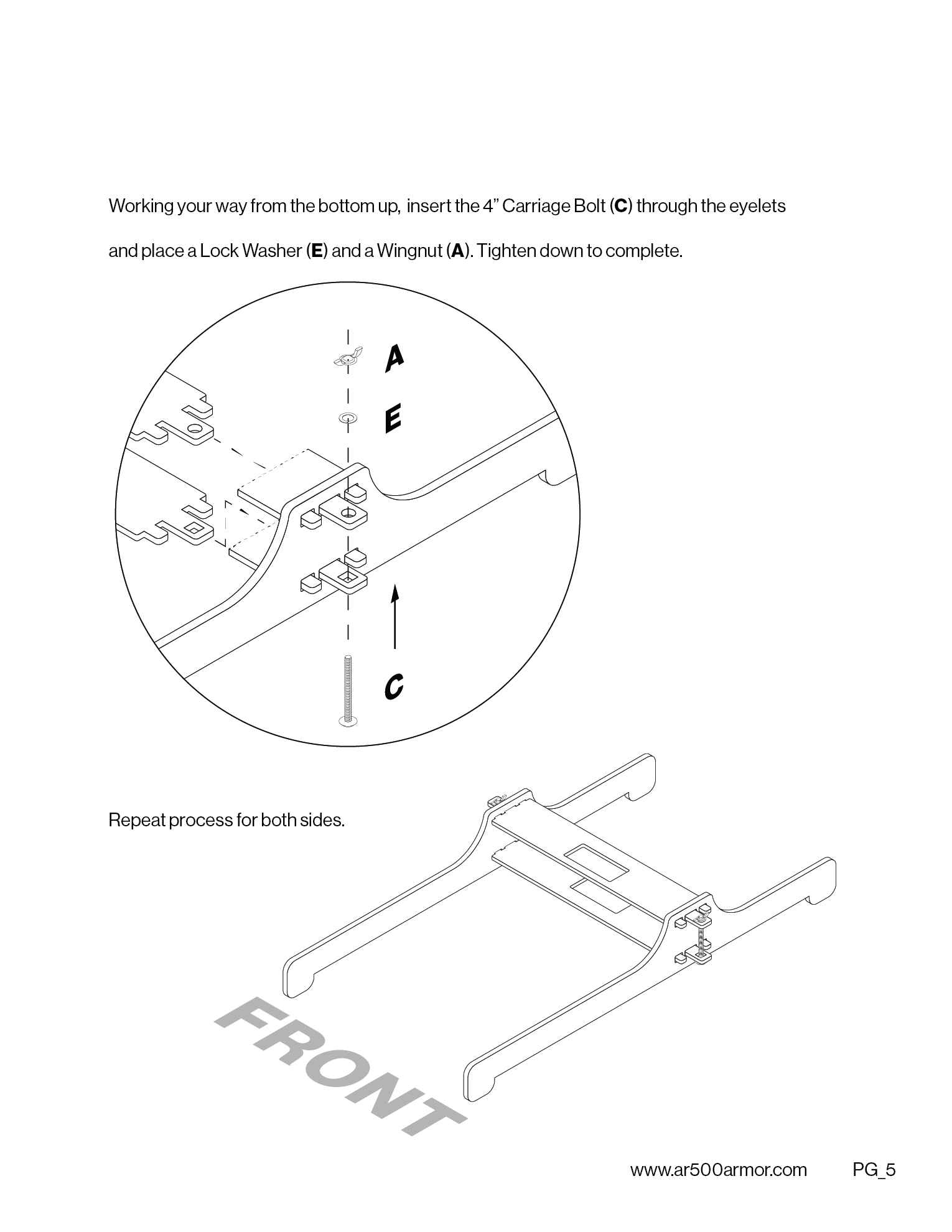
These two examples were perfect because I liked the attention to details, the isometric depth, it's black and white, has helping guides, and zoom in feature to see what's going on. I took to these concepts and added my own style.
Challenges:
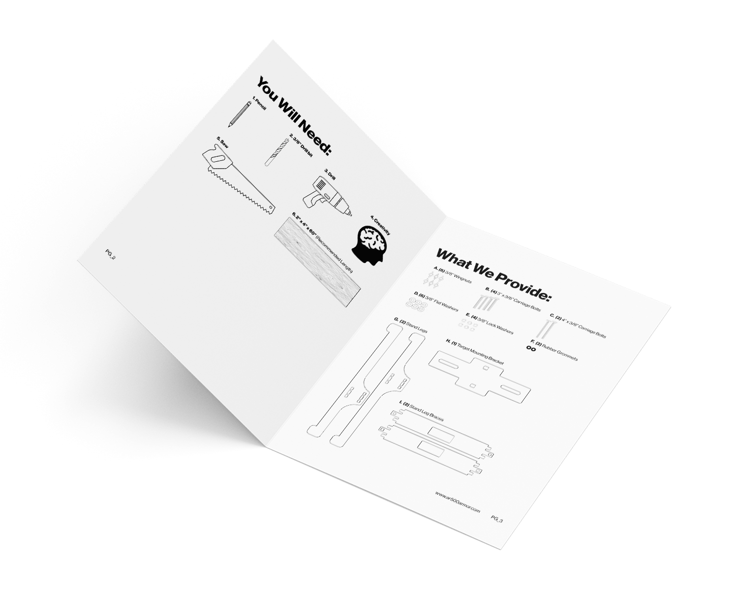
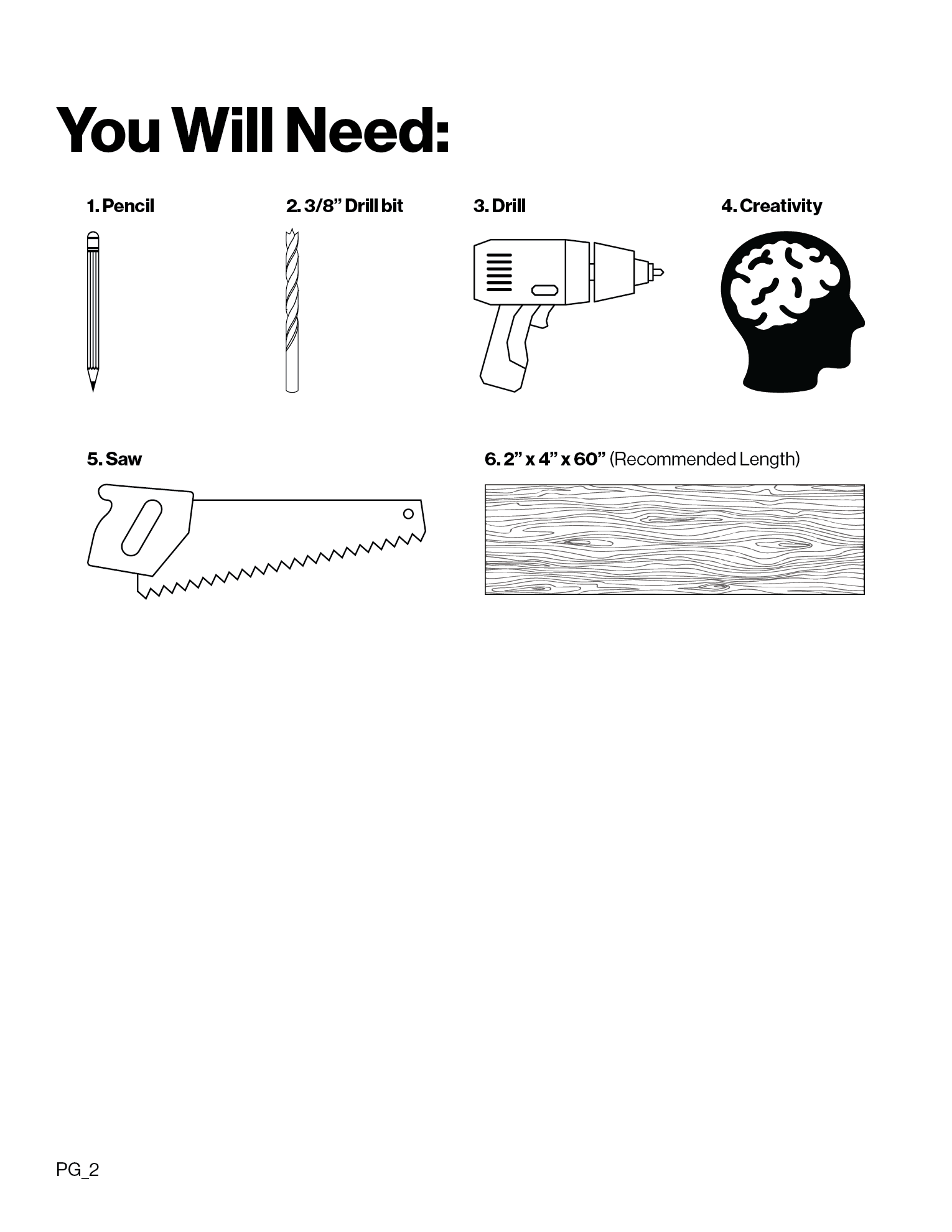
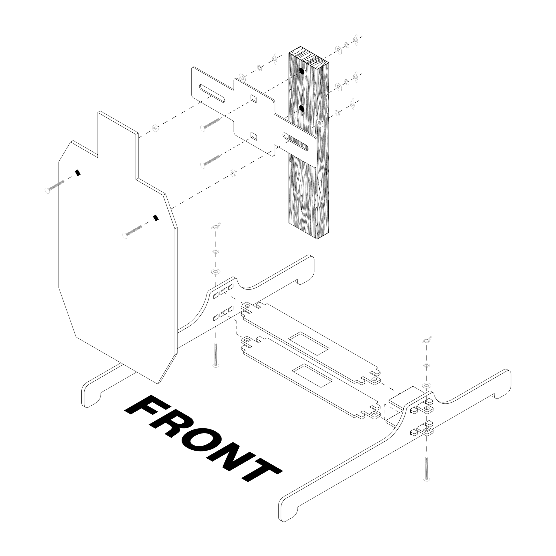
Without using a 3D or CAD program, I had to find a way to create an isometric looking image from nothing but flat design.
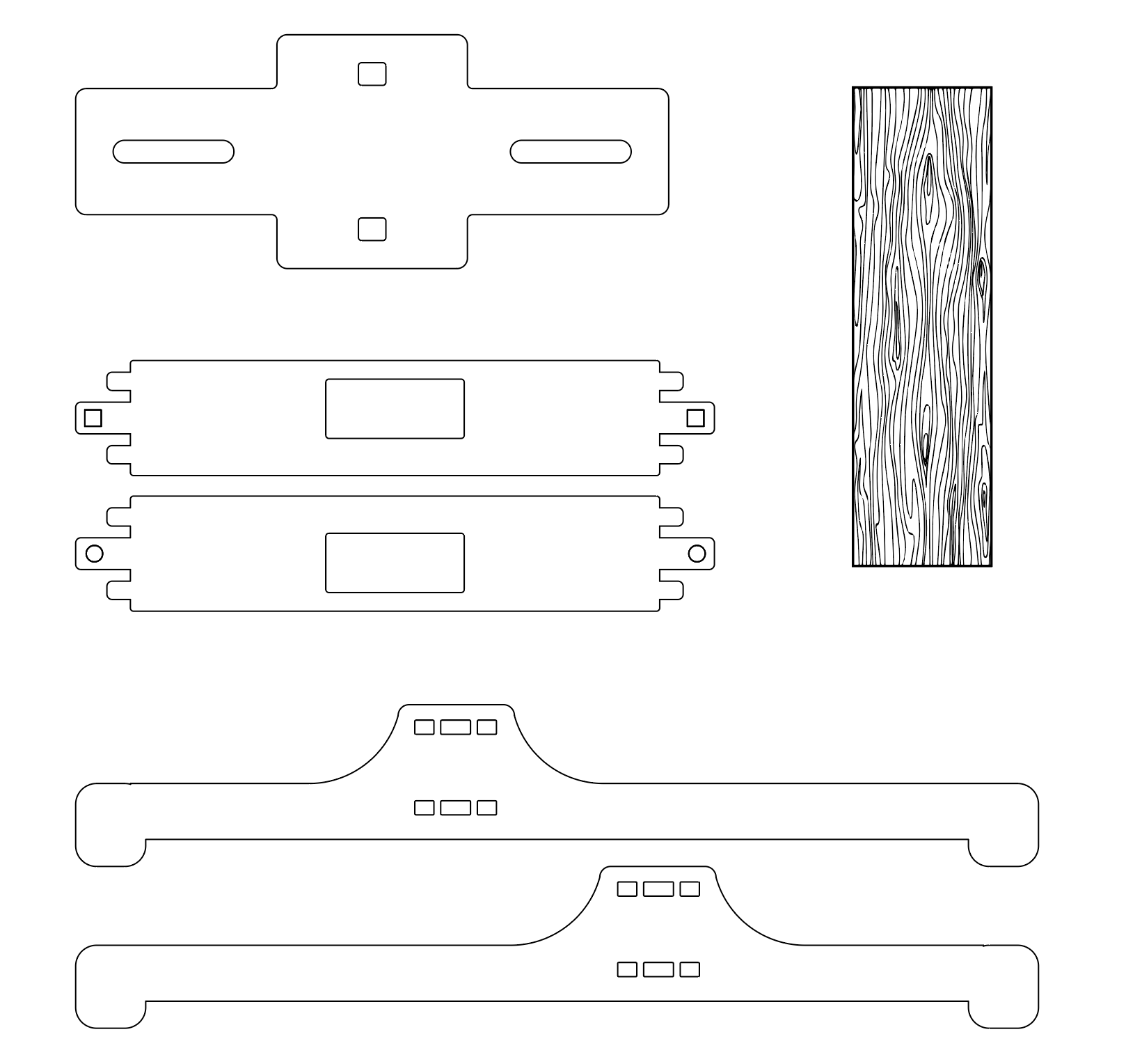
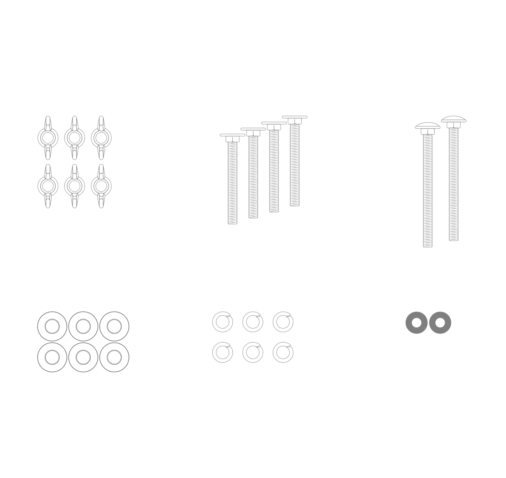
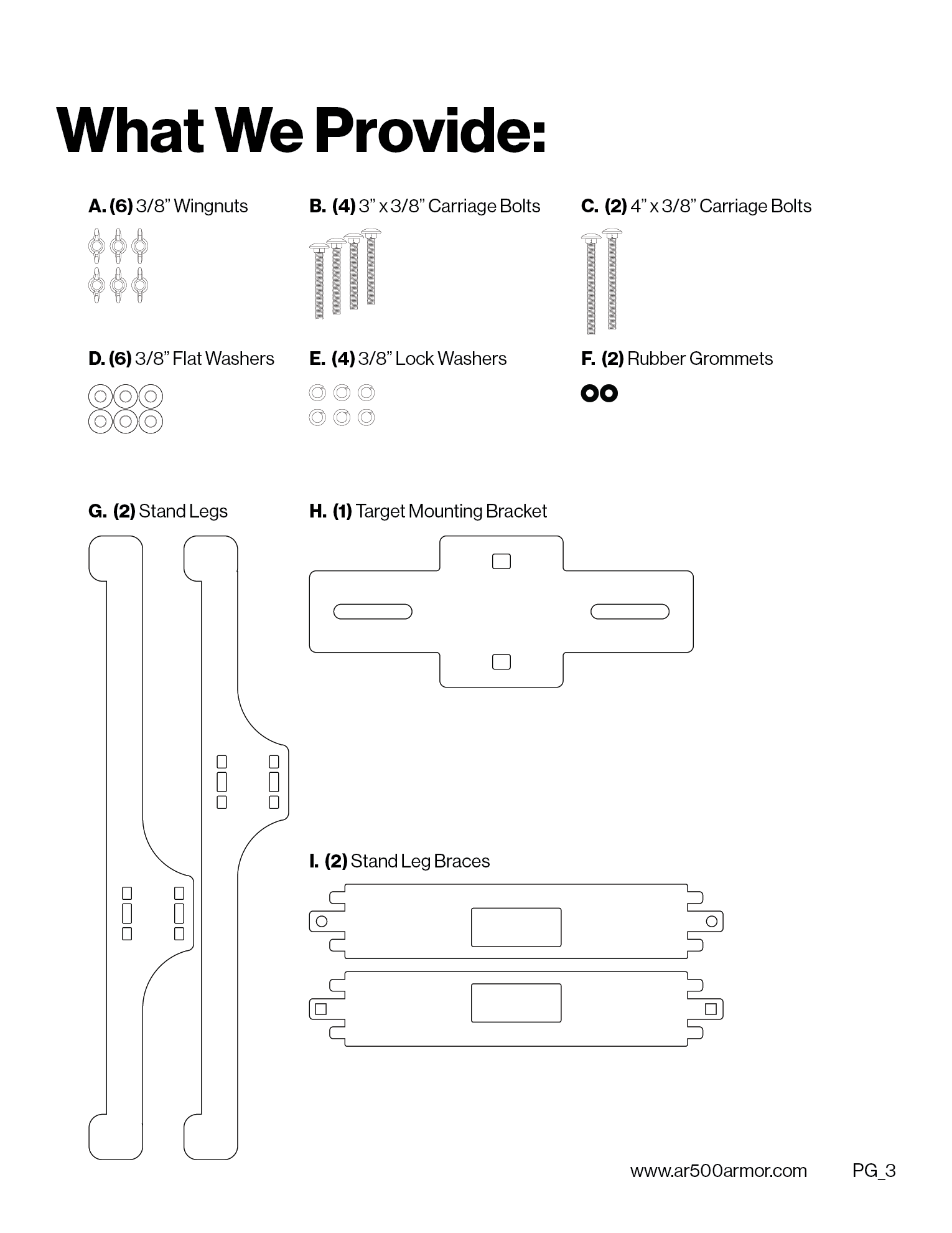
The first step was to photograph reference images. Once, I had them, I could import them into Illustrator and trace out the outlines so I knew every bolt, piece of steel, and 2x4 was sized accordingly.
Solution:
Isometric Grids. Solve. Everything.
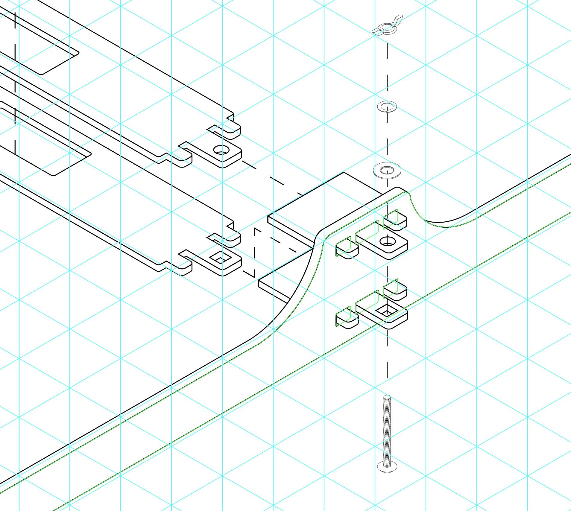
With this grid, I could give every piece a feel of depth and scale. Slowly I built up the entire part and started creating the complex pieces.
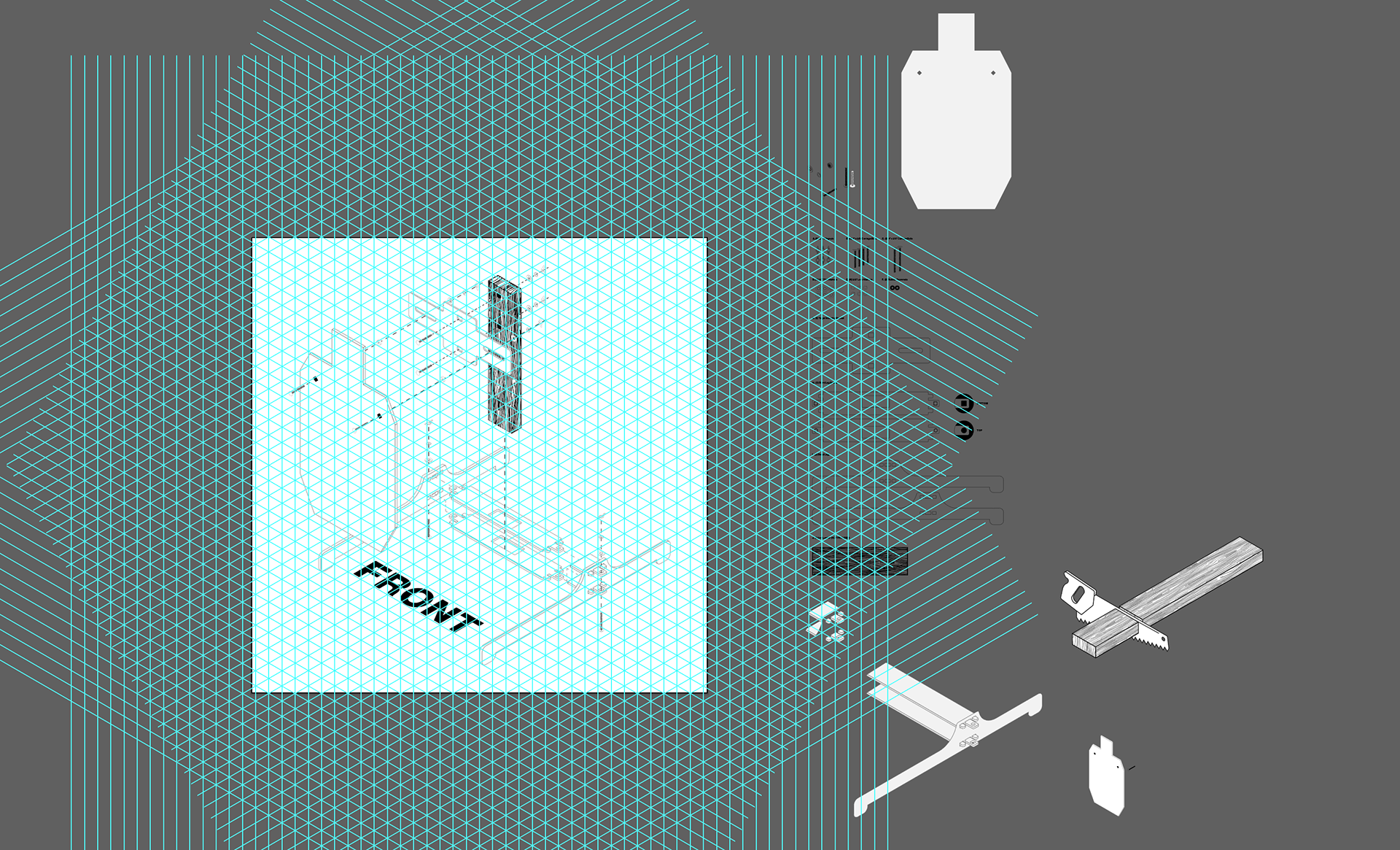
Now that all the assets were built and placed I began design the layouts, I spent a great deal of time writing copy that could be easily understood and the graphic elements could made sense. I used Neue Haas Grotesk Display Pro for this project. It's a great typeface for instructions and readability. By creating the repeatable contrast in the top left of the pages, it could give the reader a mental picture of where a process starts and stops.
The last thing I wanted to do was to make another manual that was cluttered with too many words and didn't breathe well for a reader. Each image should flow together with its appropriate instruction. All sentences were simplified down and down again to its basic core.
Mockups: