
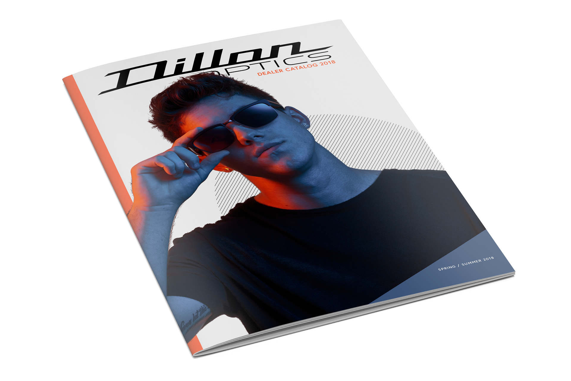
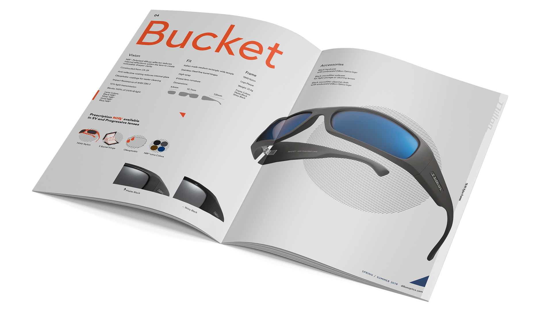
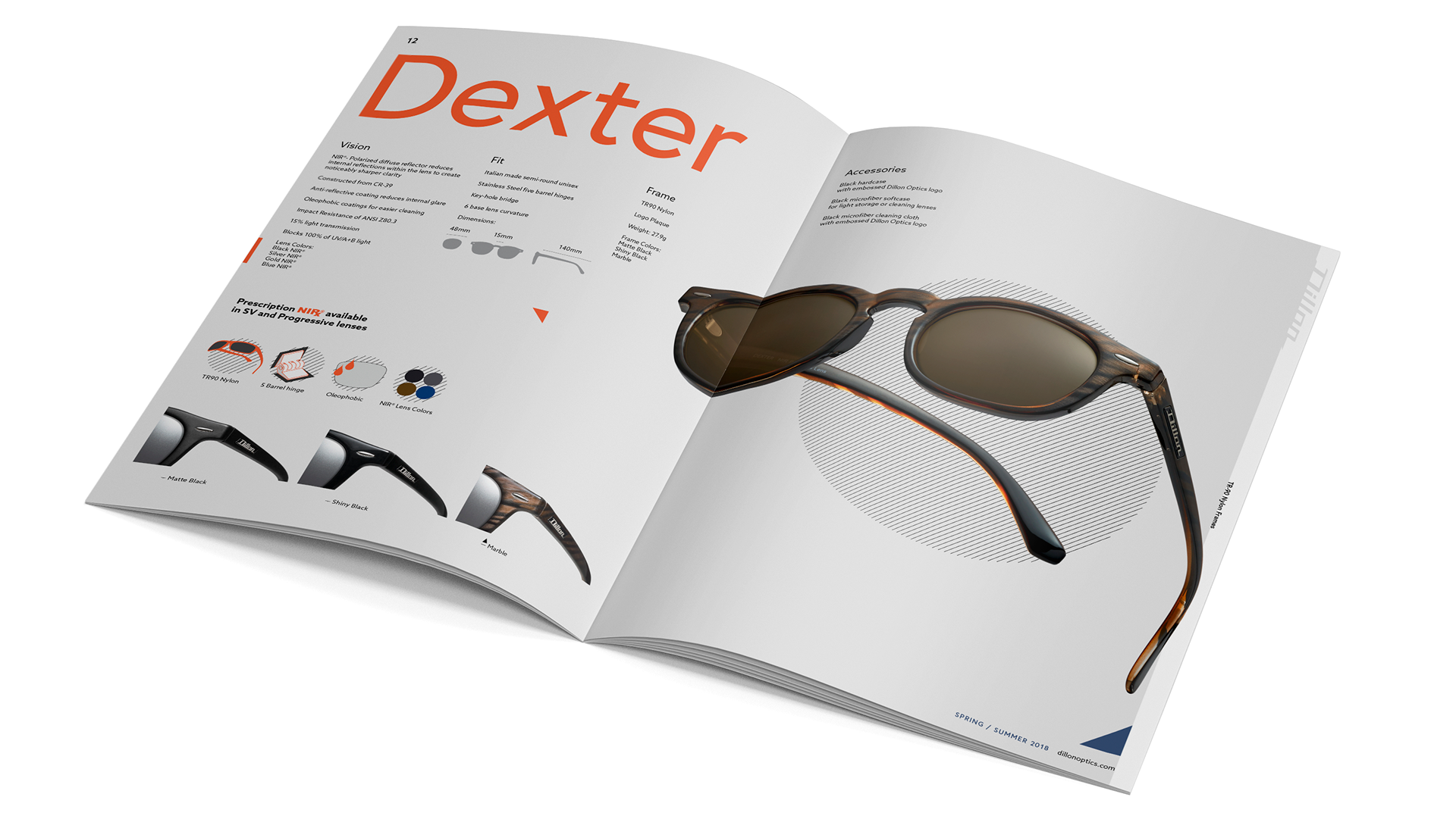
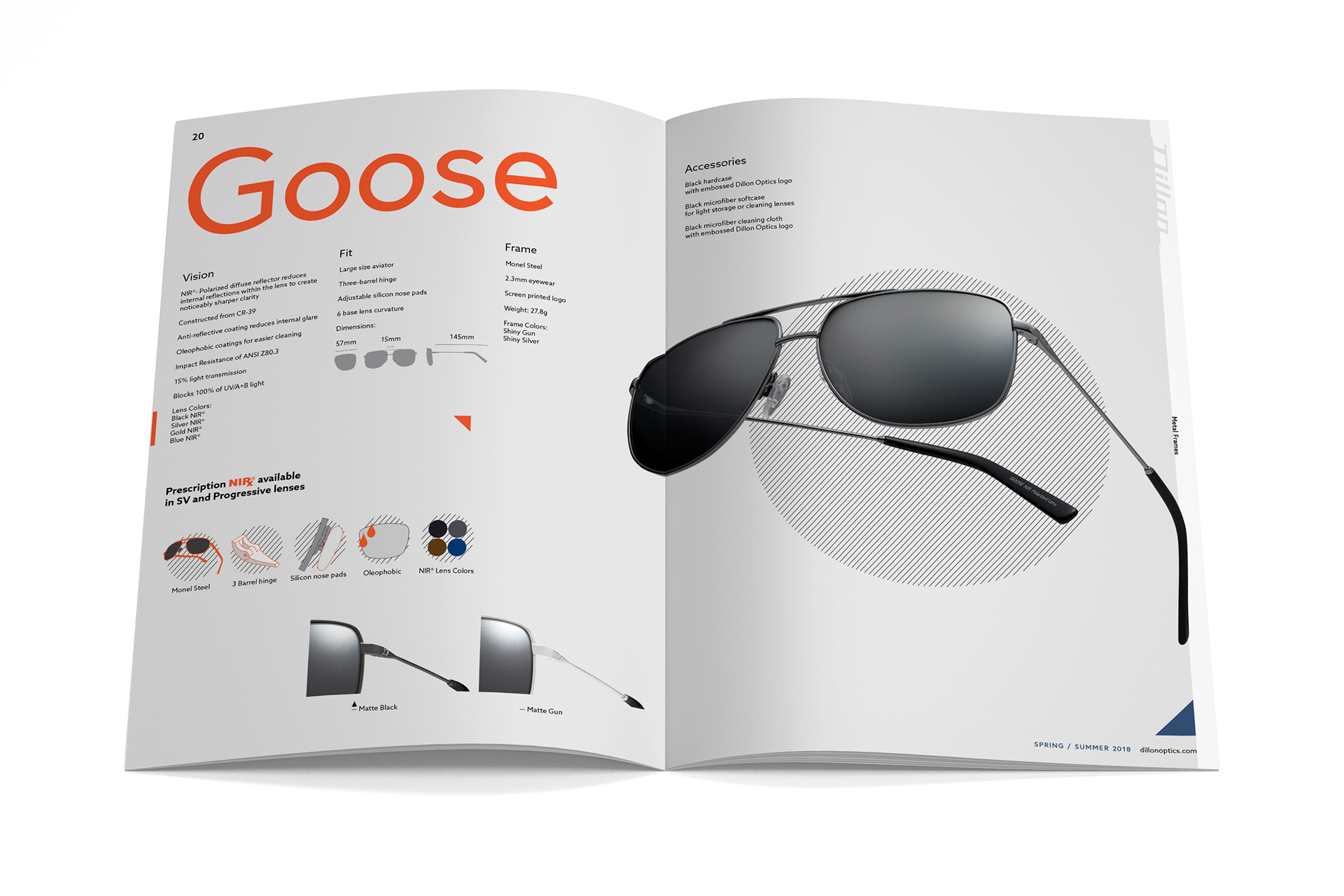
In the past, Dillon's catalog designs were boring, sloppy, and uninteresting to look at. As I helped photograph and design for them, I learned more about the importance of type, layout, contrast, and hierarchy.
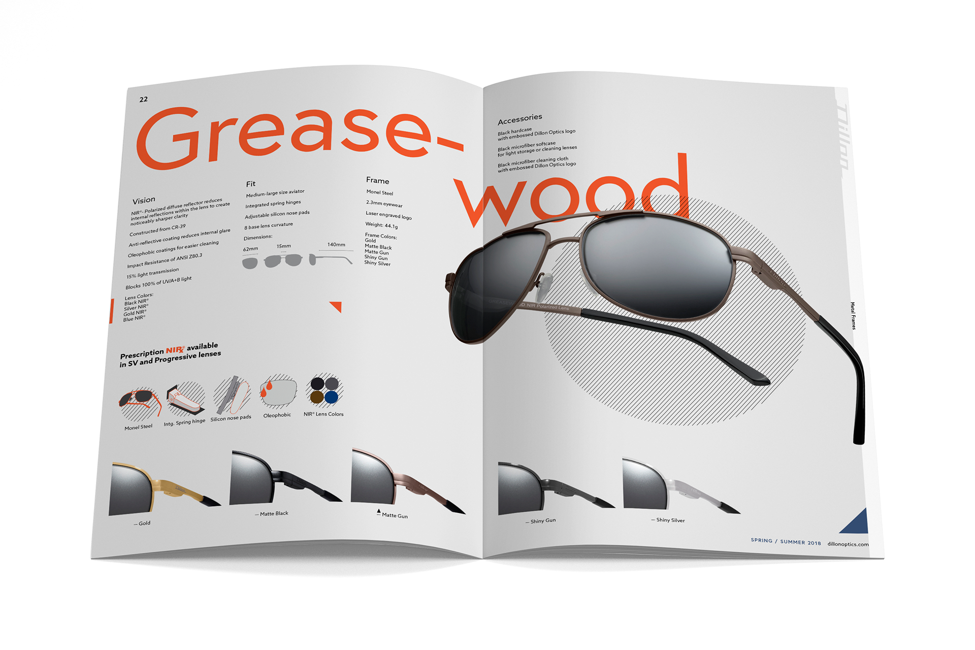
When doing research, other fashion photographers sometimes shot their subject too far back making it harder to see details in the sunglasses. I wanted to correct this by bringing the viewer up close to feel confident about the product as if they were holding it.
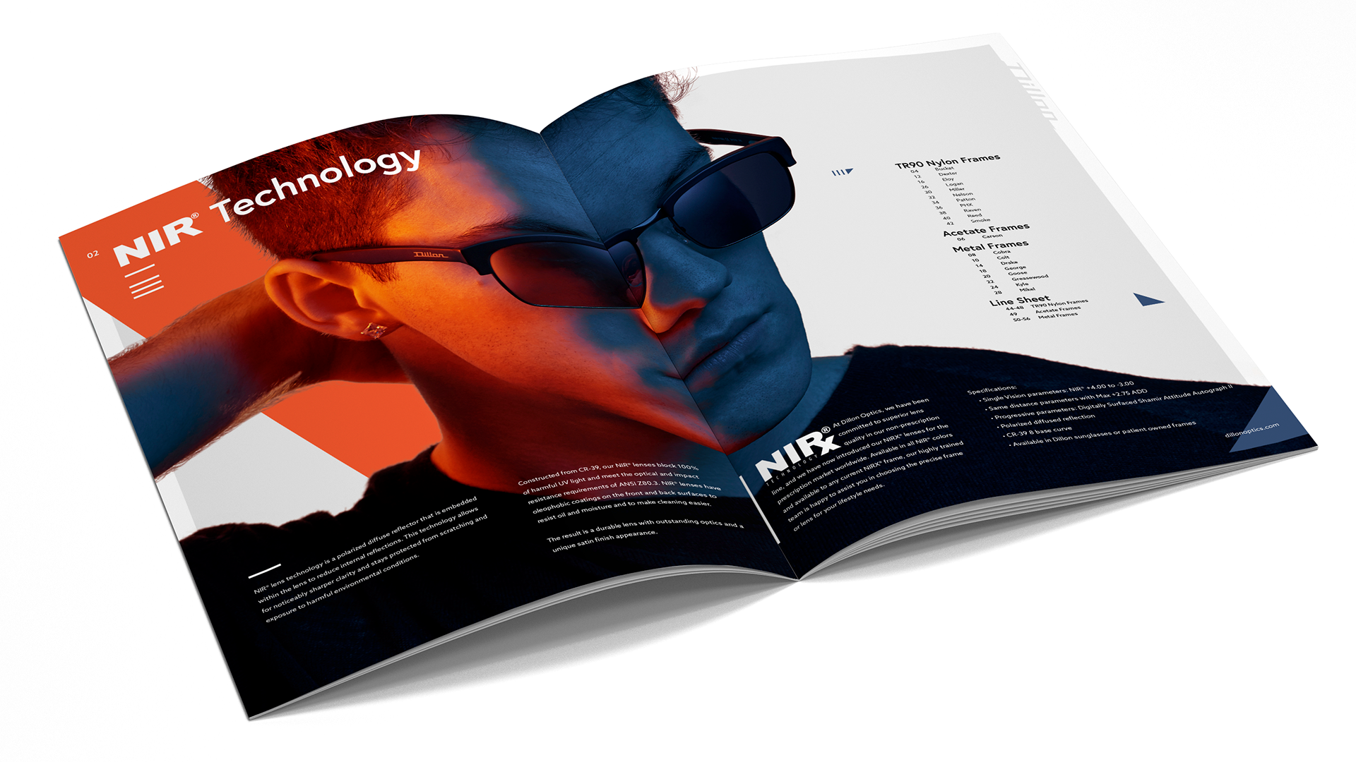
As I thought about how I wanted Dillon's catalog to feel, I remembered that viewing close up images can be a bit intimate and intimidating, which sounded perfect for a small company with BIG ideas. Those concepts together later translated into distributing large, detailed images across their catalogs.
I enjoyed playing with contrast between text and image size. I wanted the images to feel so huge that they start stretching over pages and borders.
All of the hero images were shot multiple times and later stitched with HeliconSoft for front to back sharpness.
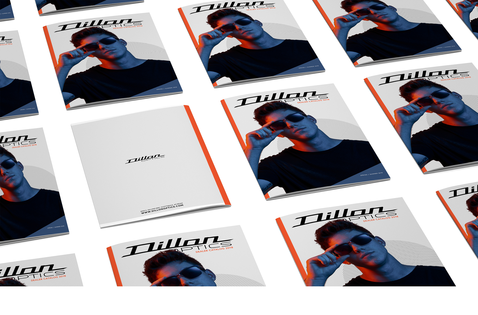

I wanted to keep the same consistency across and print designs for Spring/Summer 2018.
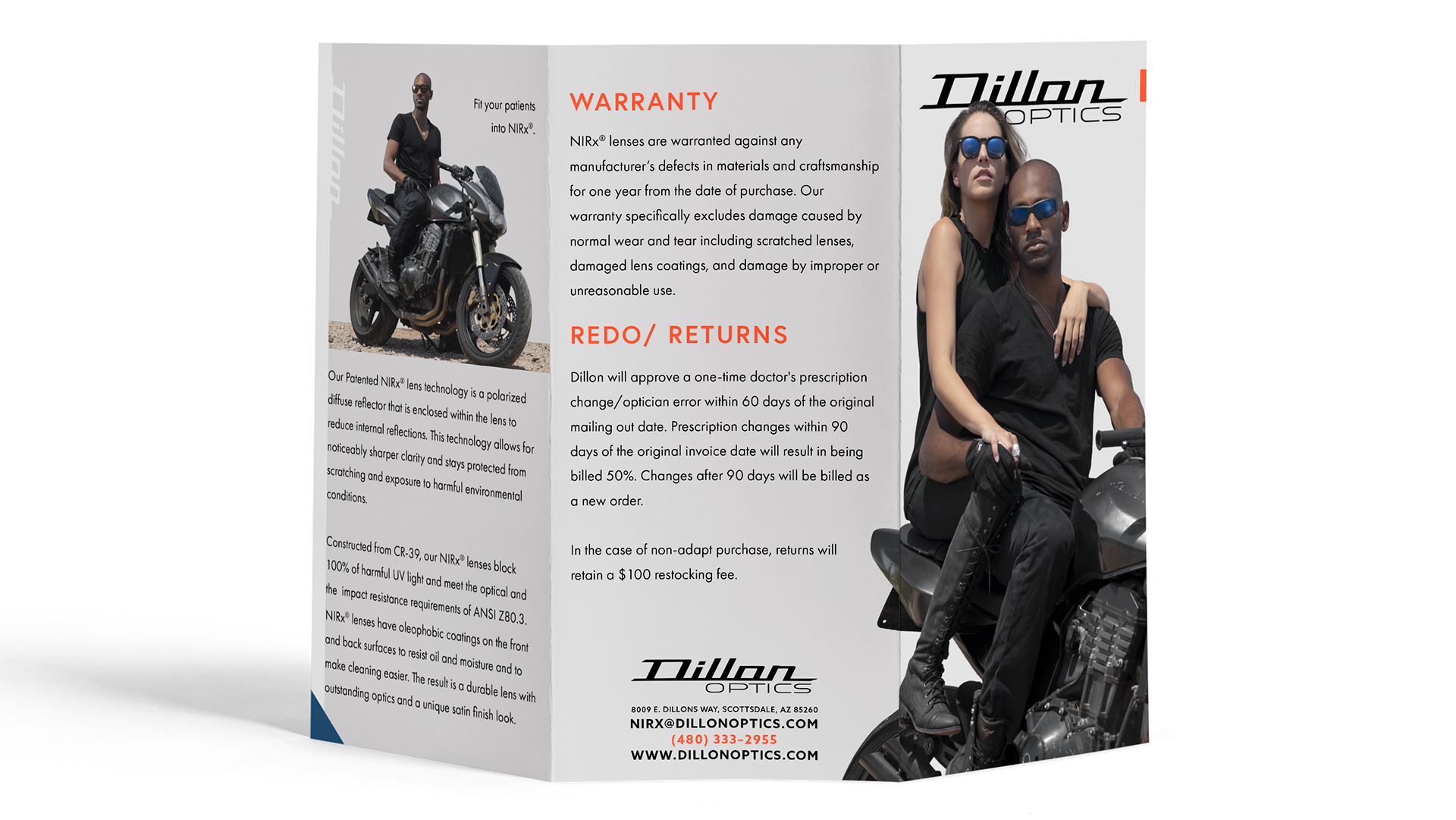
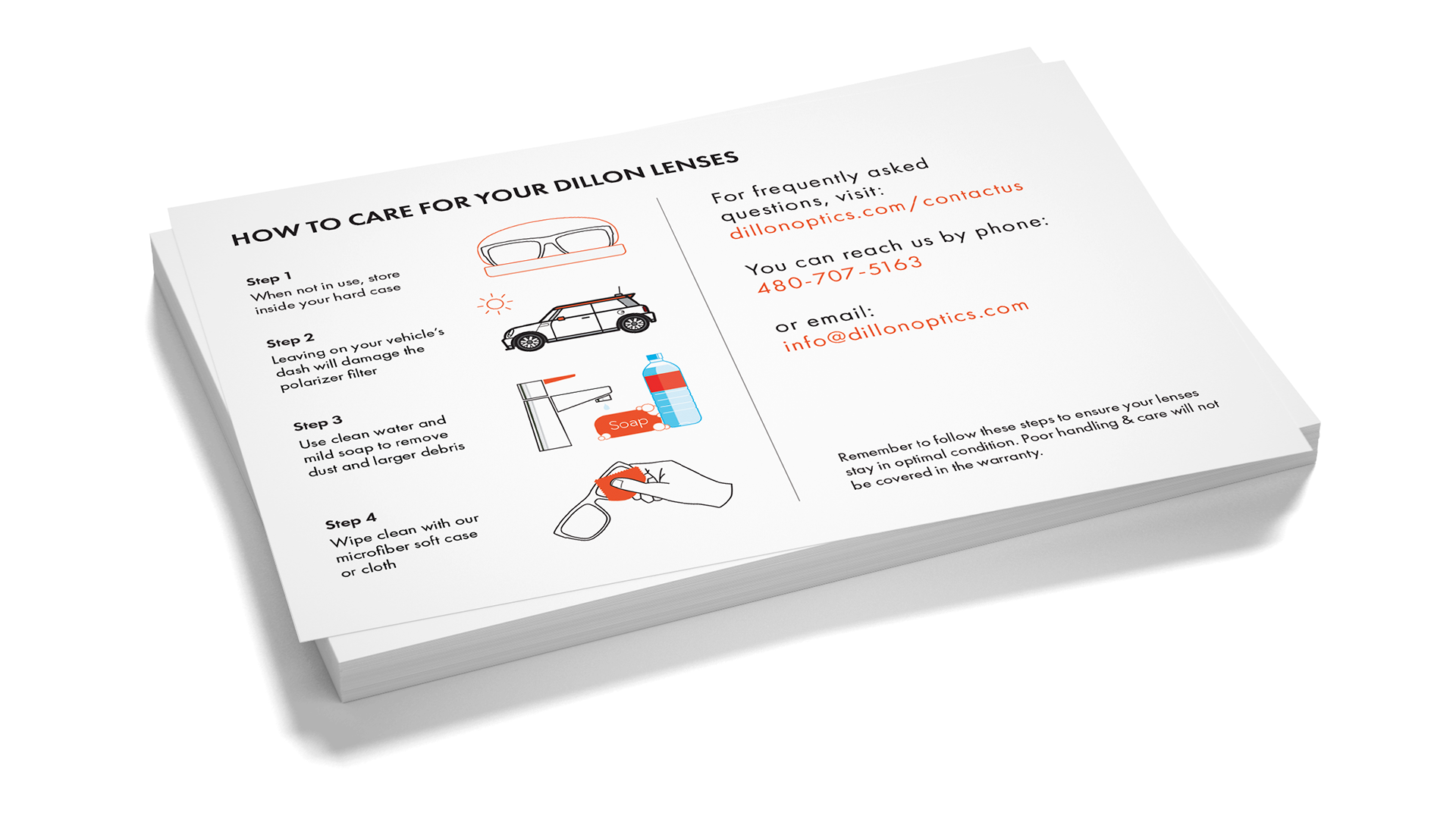
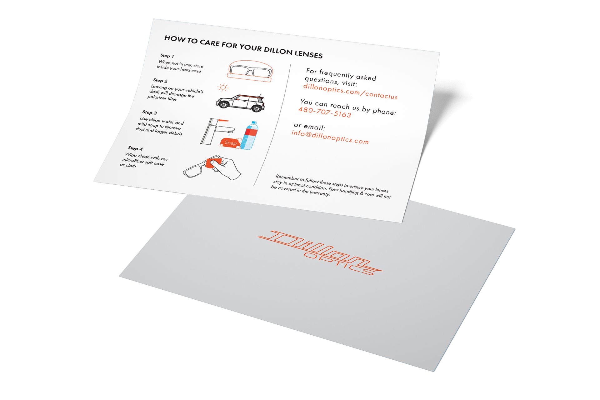
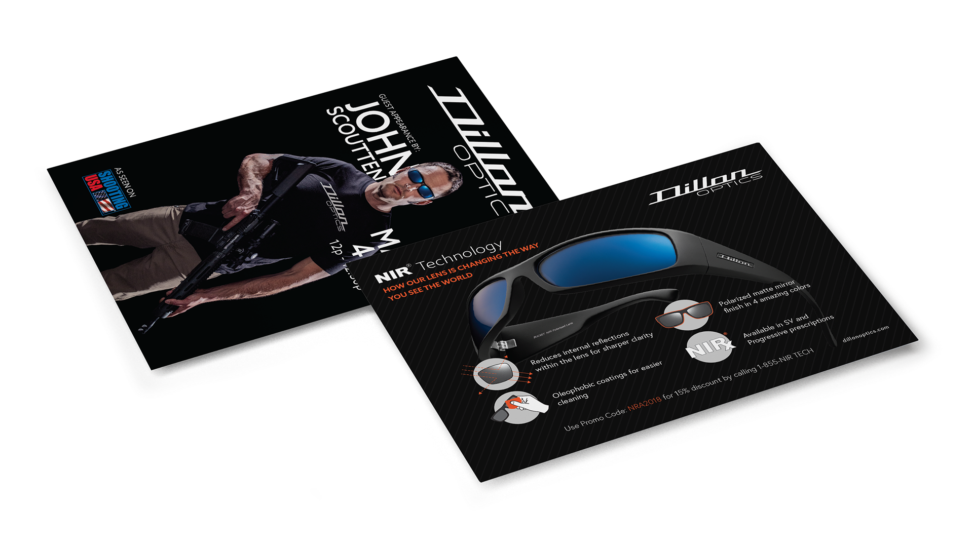
The previous brochure designer cluttered the front and back with useless textures and used multiple hard to read fonts. This approach stripped away everything but the bare essentials and built up from there. Now I was able to get more information and not make it feel congested.
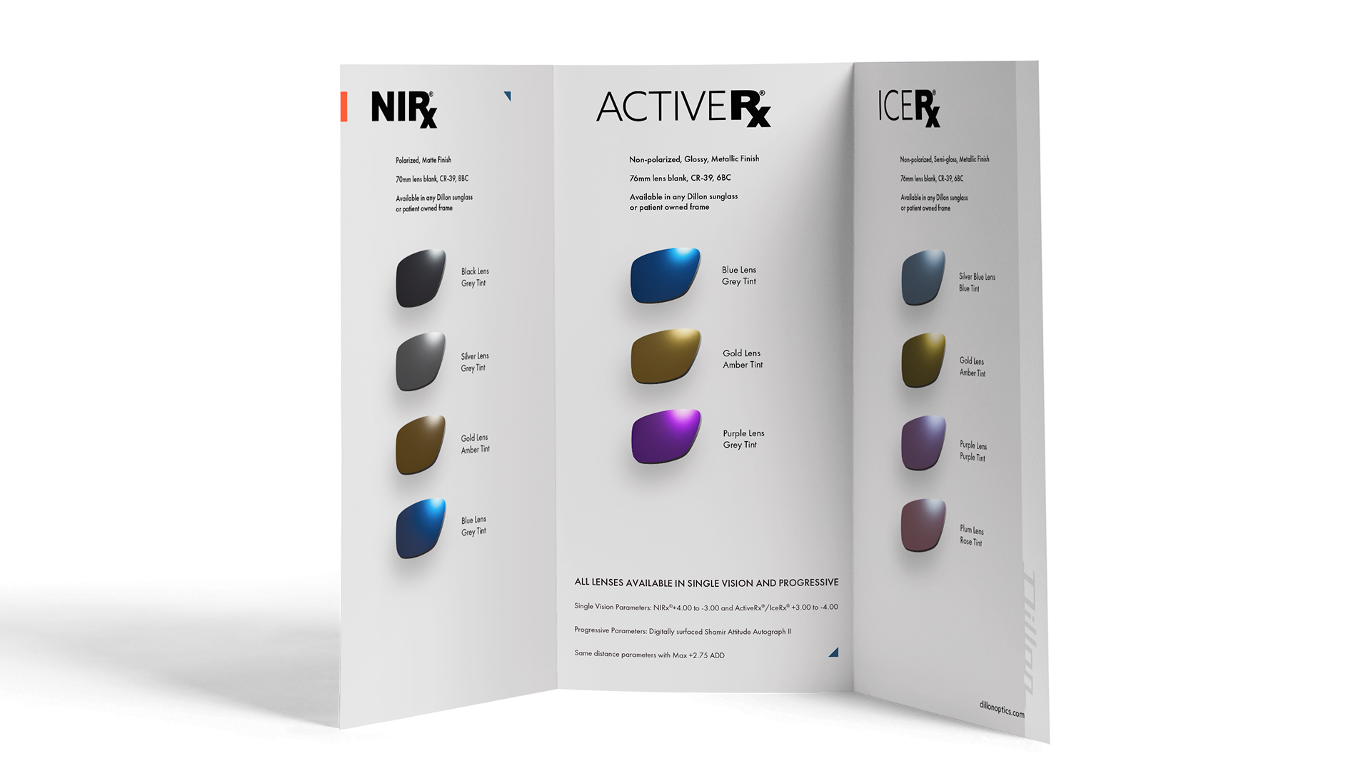

After purchasing from a PHX based company, I had their product flyer and I loved the use of minimal design. It was the perfect inspiration I needed as I was making a care card for Dillon's customers.
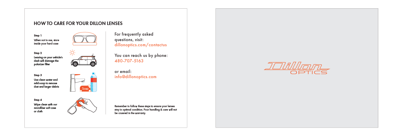
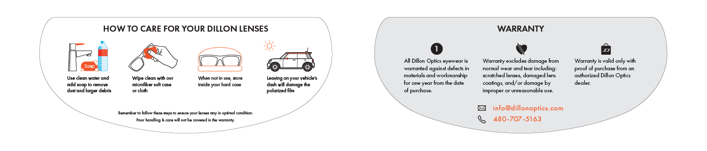
Dillon was receiving multiple calls a day on just how to clean their lenses. Sadly, it was too late for a lot of customers as the ultimately destroyed the anti-reflective coatings and had to pay costly repairs. I saw this as a huge waste of the reps time and energy.
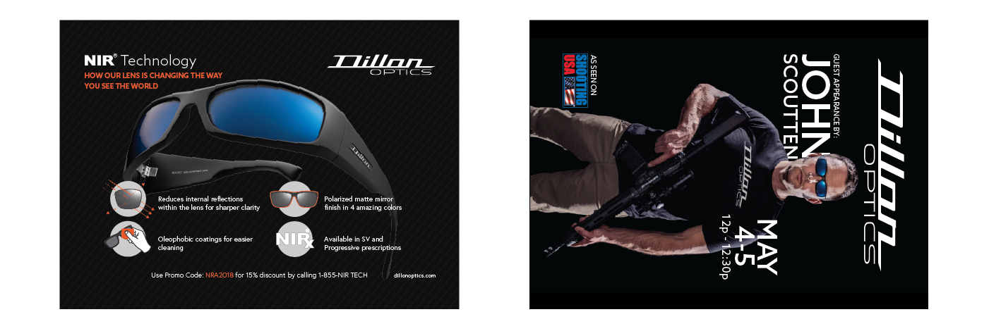
Like every year, Dillon Precision was heading to the gun show and the Optics side was tagging along. This year (2018) we had an ambassador, John Scoutten giving a talk at Dillon Optics booth.

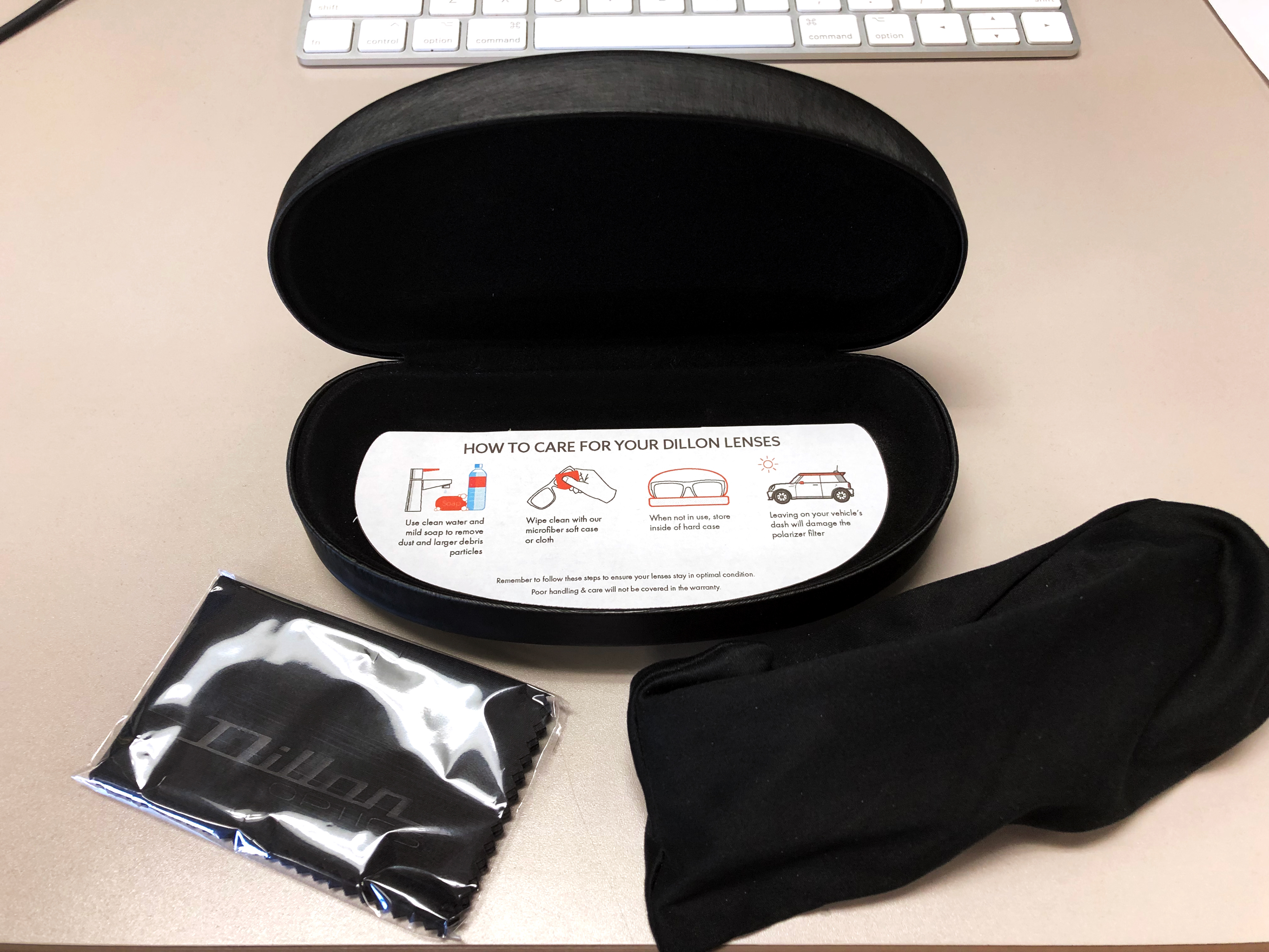
Since the 4x6 info card was a great idea, I had a better one to place in inside the hard case so customers would always have it and never loose it. It had to be visual, simple and easy to read. It also need to describe in simple terms the warranty and returns.


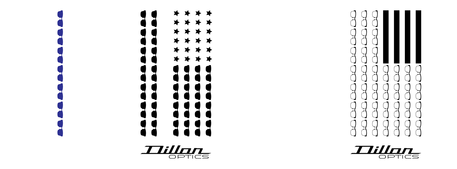
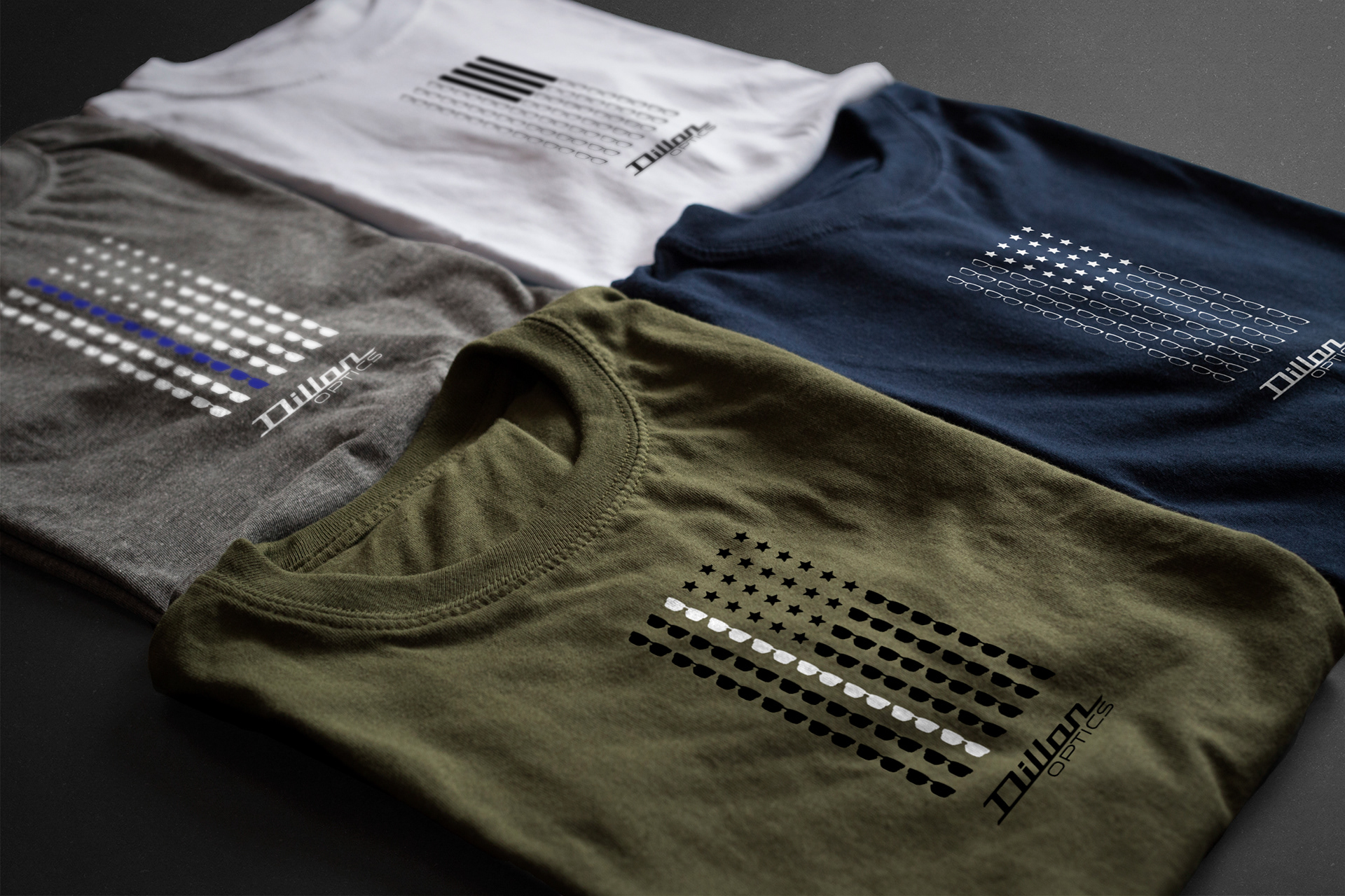
Conceptual designs to support our police officers!