

PROJECT: A sunglass company in Scottsdale, AZ needed a complete overhaul of their website. I provided the images, design, research, branding, and rebuilt their way of processing returns for quick and easy customer inquiries. Here are the designs I presented to them.

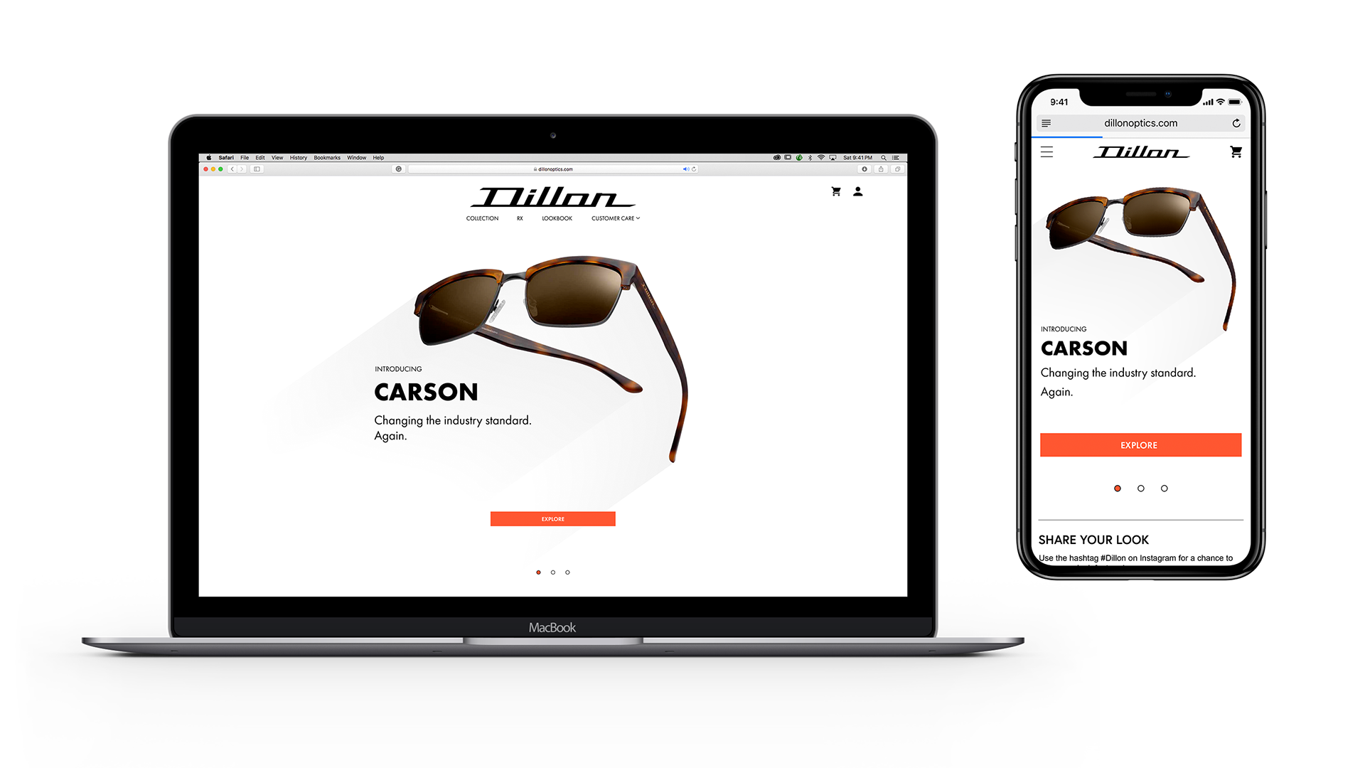
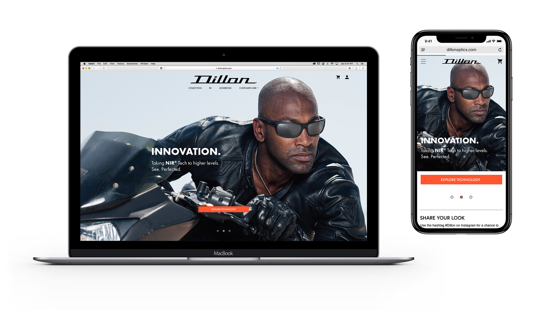
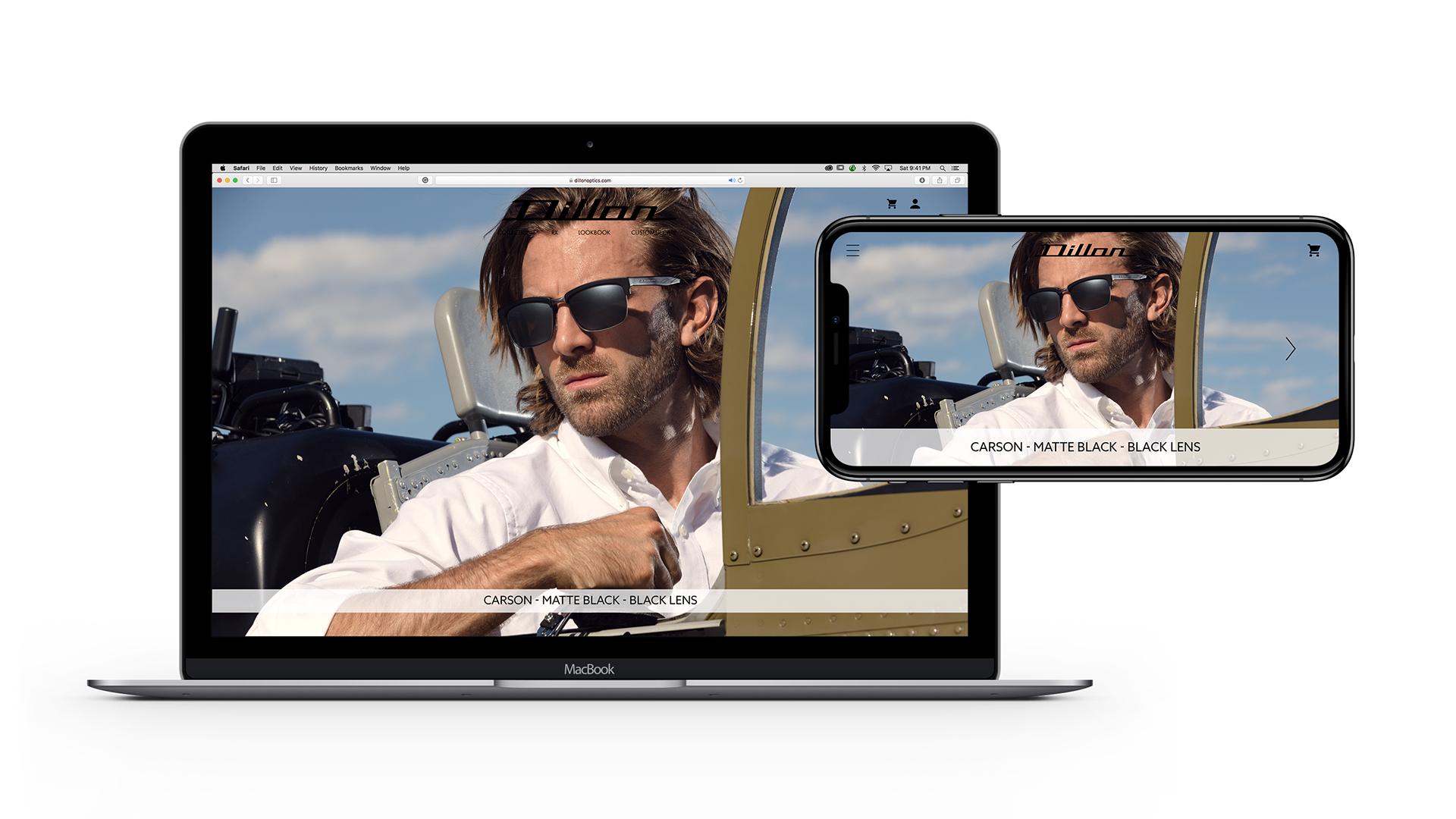
The old website's home page had a small container and tiny imagery, making it appear small and insignificant. My goal was to be borderless and open with full-screen detailed images. The home page would also be a place to see updates and changes as the product line grew.

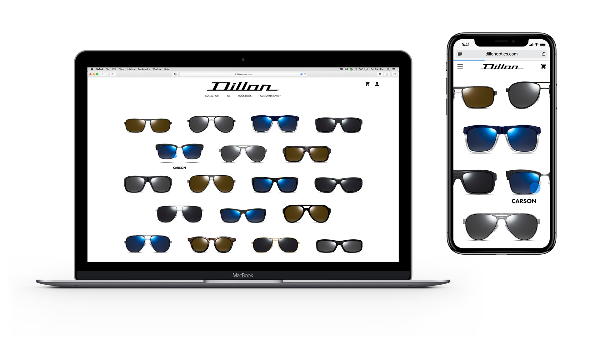
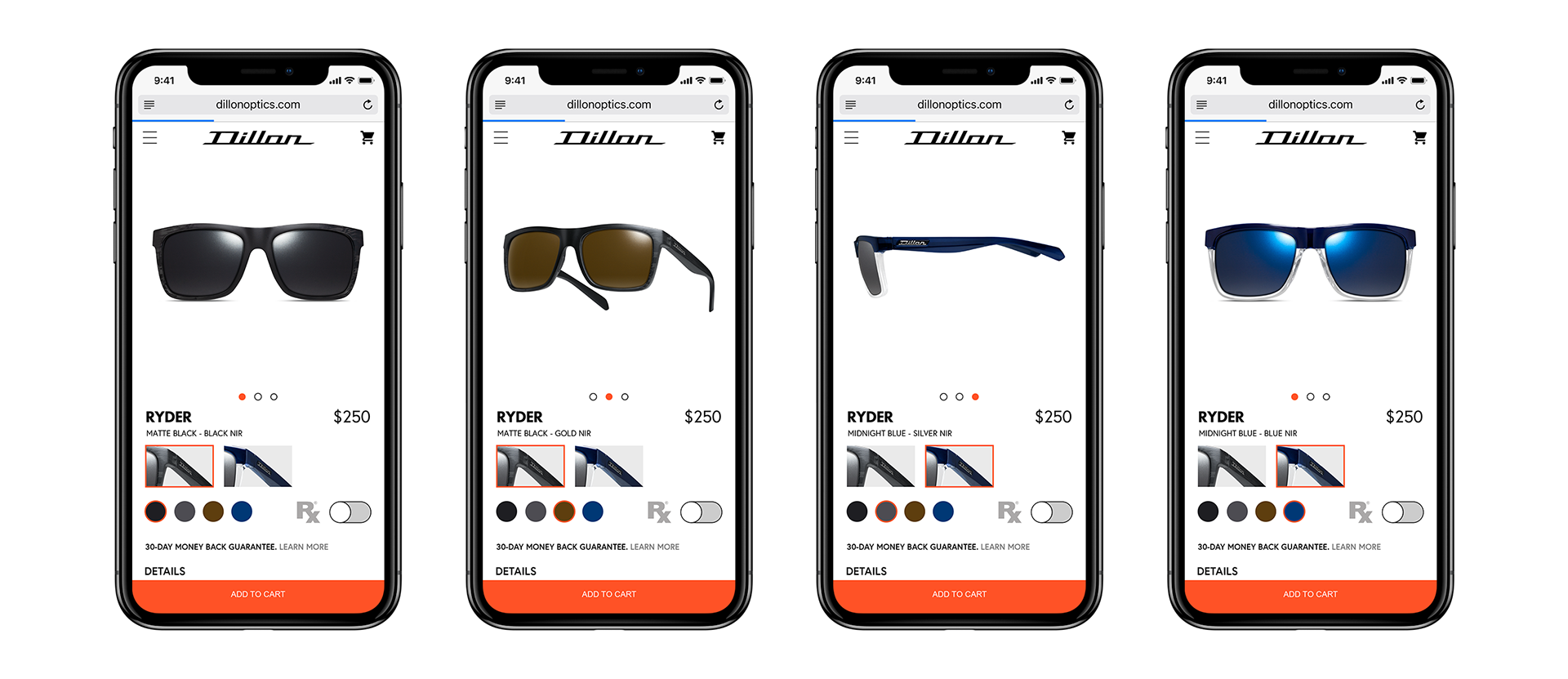
You'll hear me say "update" and "consistency" a lot because it's true. Everything was redone from the ground up. The old collection was rarely ever click on. The site's primary tree based navigation was a tree and it had too many roots built in it. Would you like polarized or non-polarized? Metal or Plastic? Frame name? Lens Color? Too much!
This new approach is much simpler and allows you to see your sunglass big and in detail. With every frame being on display, customers are one click closer from a purchase. I decided to reveal the names and have the frame float on a hover action for two reasons. Most of Dillon's customers identify with images more than names and my first ever images shot involved a floating frame and became the 3/4 view used today.

Adding a lookbook took a bit of convincing. I wanted to incorporate an example of how we view a luxury lifestyle and double the page as free marketing and advertising within the site.

Guys may be clueless about lookbooks, but ladies who are shopping will most likely know what this means and will be drawn in to see examples of what their man could look like. To help navigate to their frame of choice, I've added a link below that take the customer to the correct product with the exact style load out.

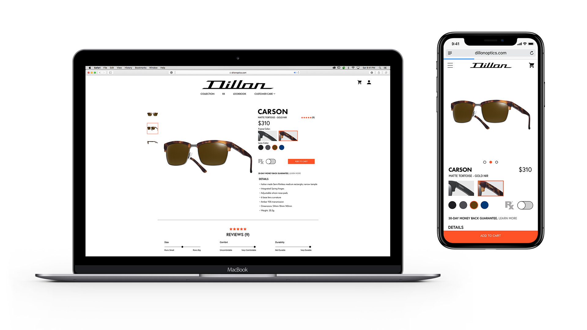
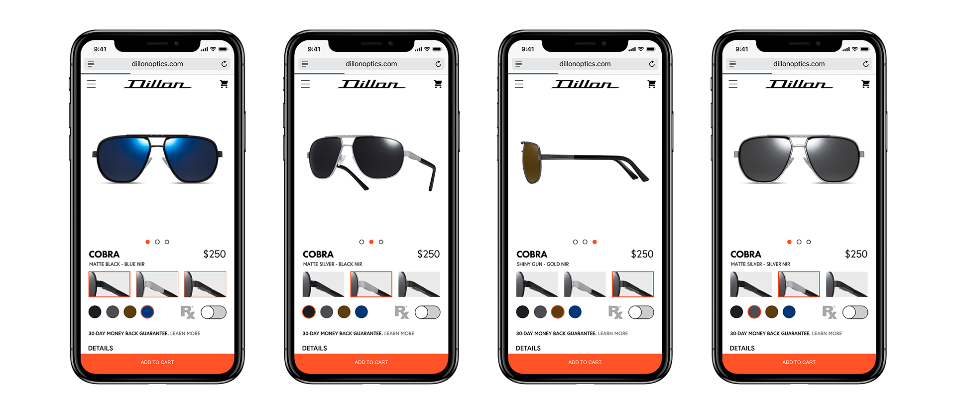
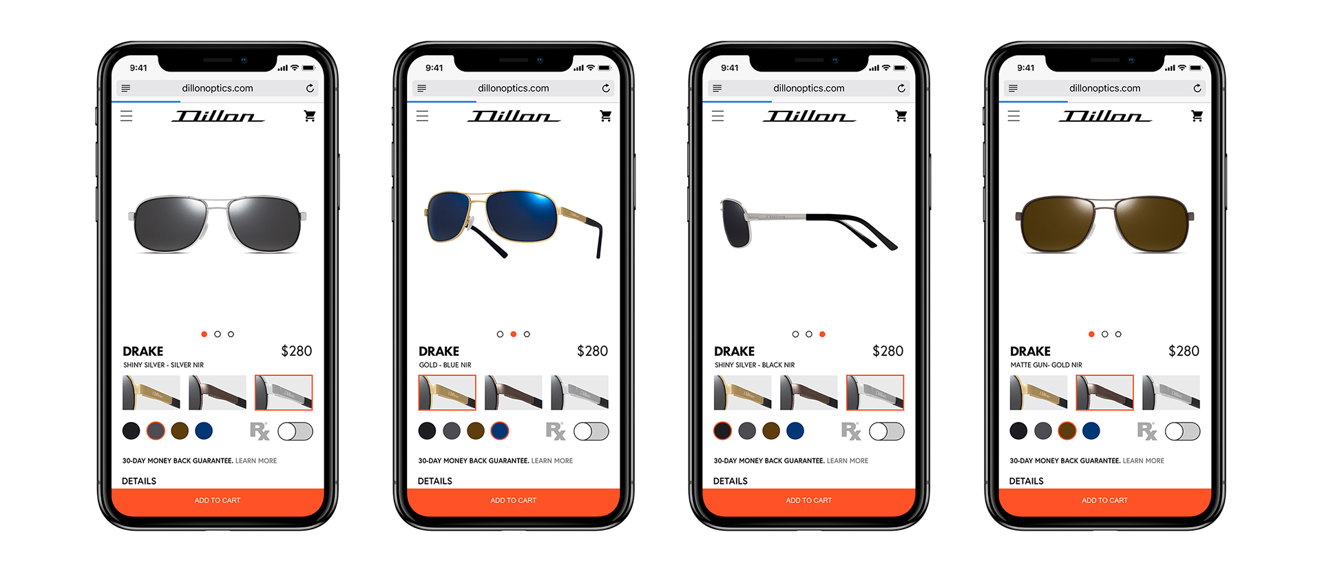
I wanted to continue the clean look and ease of use across the whole site and the product page was no exception. I wanted to showcase every frame on one page. Because of my expertise in photography and photoshop, I was able to achieve the look I wanted. No matter what selection is made (i.e. frame or lens color) and new image would be loaded, and it would appear as if you only changed the lens or frame color.
Below are more examples of customizing your frame.


Dillon also needed a way to create prescription orders. Instead of making a separate RX page, I recommended to create an order form within the page.
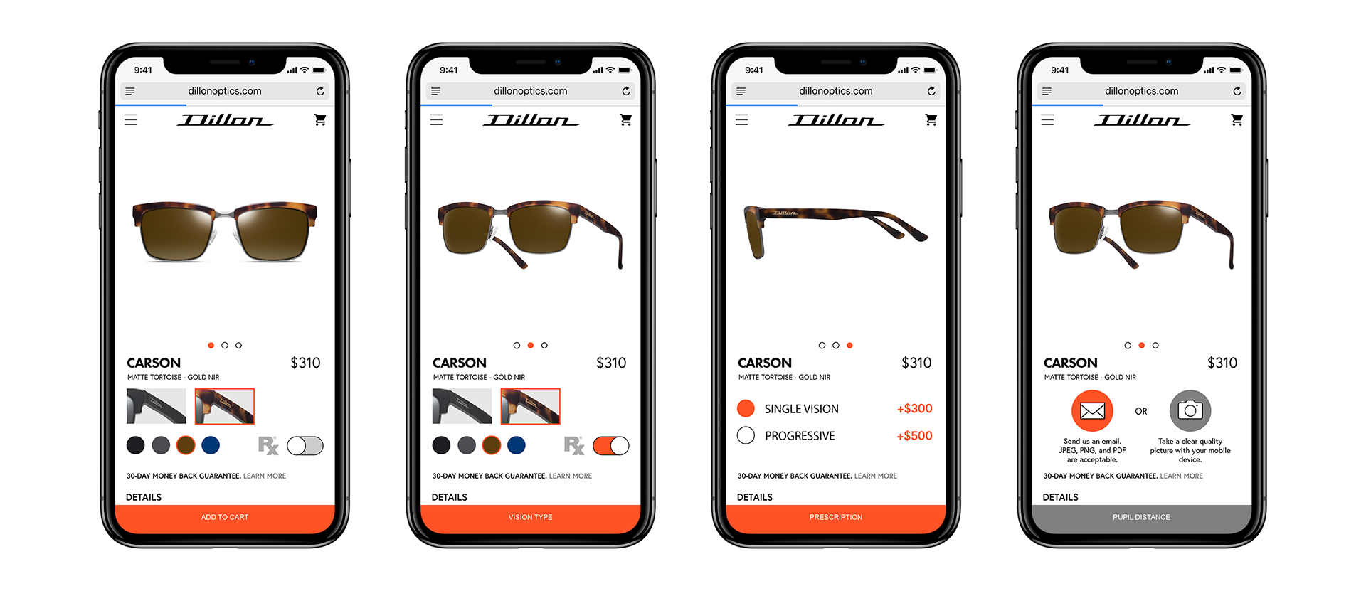
Once the RX switch is active, the Add To Cart button changes to Vision Type. As one progresses through, the will be able to select single or progressive lens and upload their prescription through email. Orders cannot continue if nothing is sent through.
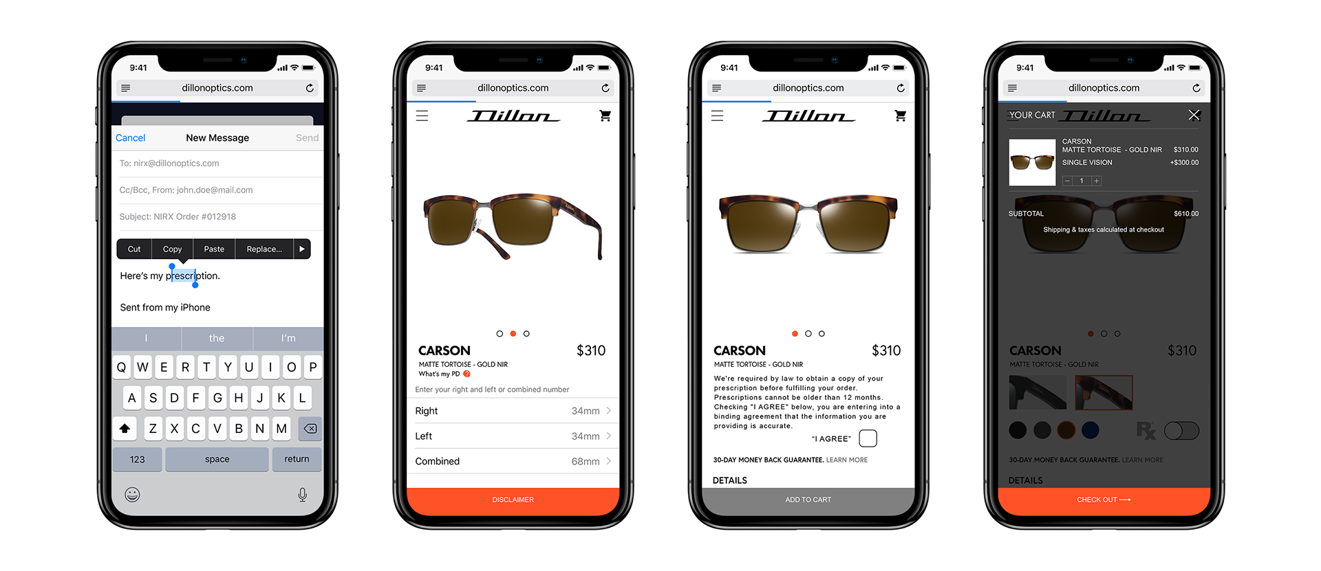
After emailing the prescription, customers and input their Pupil Distance, confirm the Disclaimer, and view the cart to checkout. This process cuts down on the number of orders that were being taken over the phone or by email.

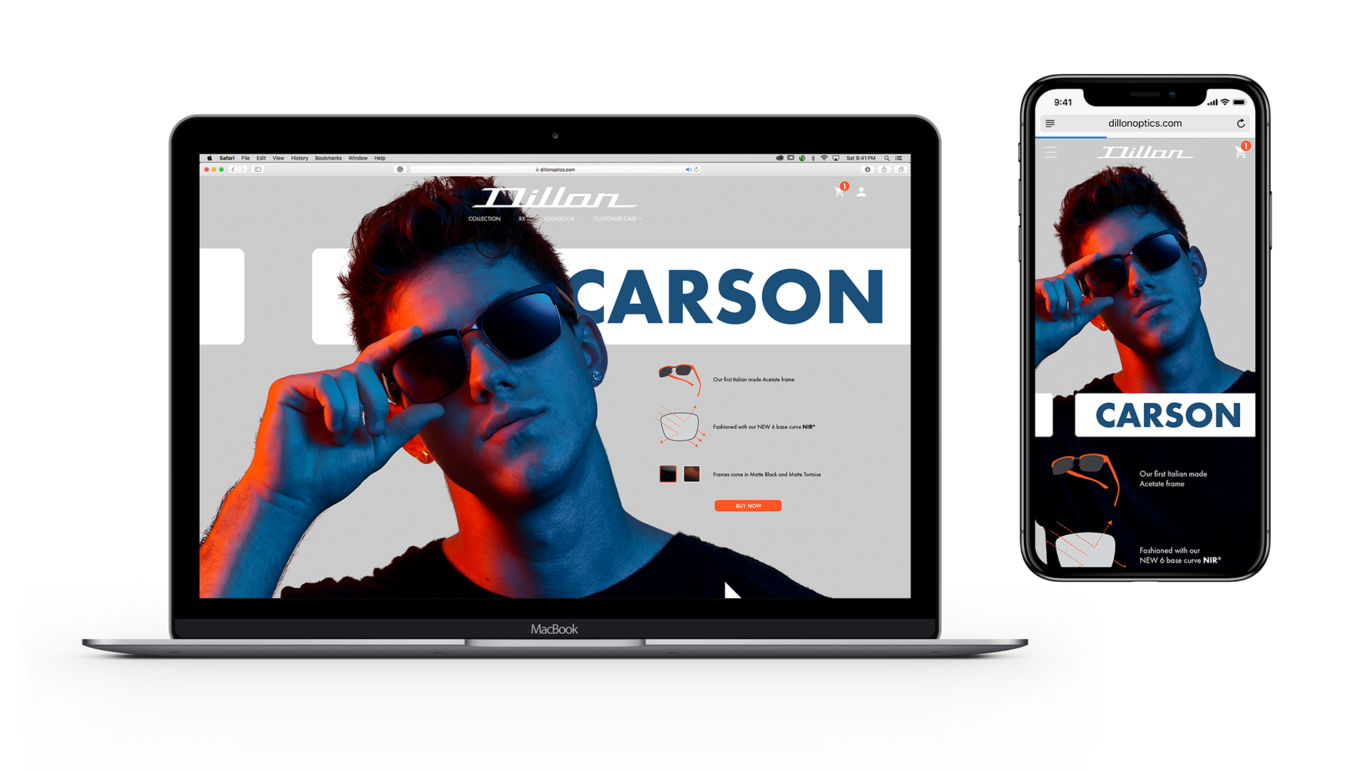
A featurette concept page that wasn't implemented. The purpose was to take a celebrity and showcase them with their choice of frame with additional product information. A Buy Now button places the exact product with frame style into the shopping cart for quicker checkout.

Provided a technology video describing the benefits of Dillon's frames and lenses. I shot, edited, and provided motion stabilization and tracking of text.
